
Inhaltsverzeichnis
In a rush?
Download the PDF for later
Introduction
Ask ten product managers (PMs) if it’s important to improve their product adoption, and you’ll get ten enthusiastic responses of “yes.” Now ask those same PMs what improving product adoption actually means, and you’ll get ten different answers that likely all start with “it depends…”
While driving adoption is a common goal for product managers, it’s less common to see a consistent framework for doing it successfully. This guide is intended to introduce key concepts and steps to measuring and improving product adoption, and serve as a conversation starter for teams.
Before we jump in, it’s important to note that these five steps are not one-and-done actions. PMs should always be re- examining their product engagement and adoption metrics and coming up with new (and better) ways to keep users engaged and drive adoption over time. Think of them less as boxes to check off, and more of a continuous cycle.
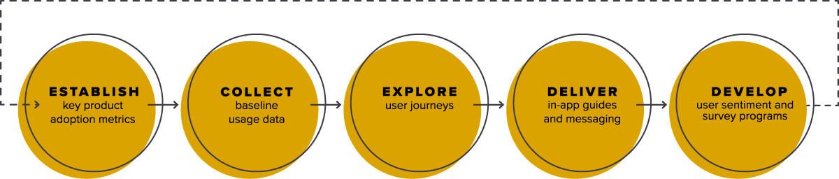
1. Establish key product adoption metrics
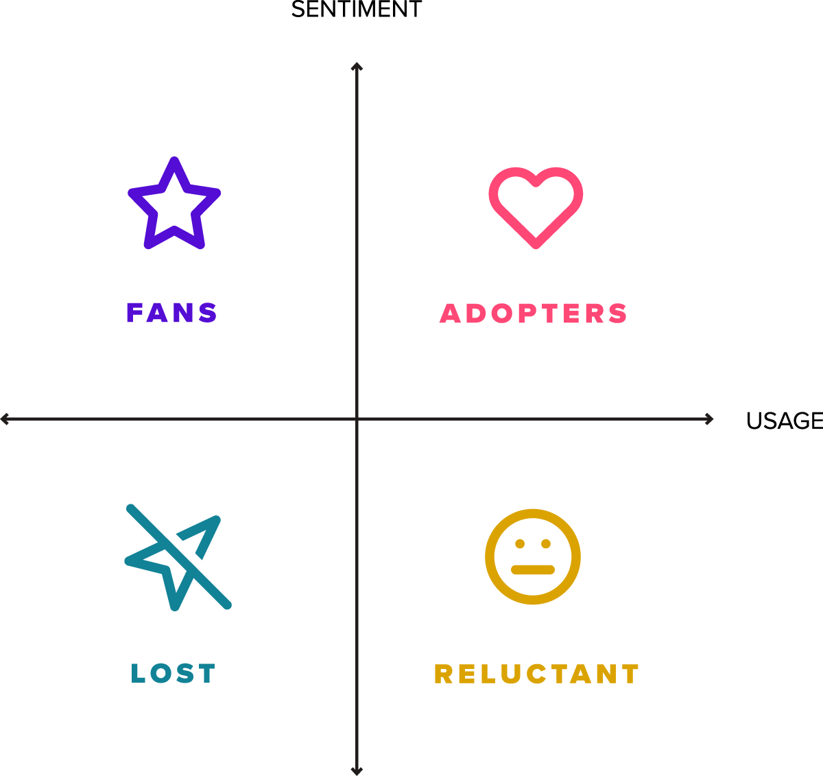
Tactically speaking, product adoption measures user activation for a web or mobile application. It can be expressed over time, for example using monthly active users (MAU), or as a rate relative to signups for a given period. Philosophically, product adoption exists at the intersection of usage and sentiment, and is the difference between products that a user “has to” use, and products they love to use.
Well-adopted products tend to share these attributes:
- They help users discover value quickly
- Users keep returning and using the product
- Users explore more of the product over time
- They encourage habitual, regular usage as the product becomes part of a user’s routine
These characteristics can be measured practically with three key product adoption metrics: feature adoption, user stickiness, and app retention.
See how you stack up with our interactive benchmarking tool.
Funktionsakzeptanz
Feature adoption measures the concentration of usage across a product’s feature set.
If usage is concentrated in a small percentage of a product’s overall feature set, it can indicate that users are familiar with only the core workflows and are not exploring other (potentially valuable) areas of the product. In contrast, usage that is distributed across a broader set of features indicates users are discovering more ways to use the product over time, and finding value beyond the core workflows.
There are many different ways to measure feature adoption, but one useful way is to measure the adoption of your product’s most important features, also known as your Core Events.
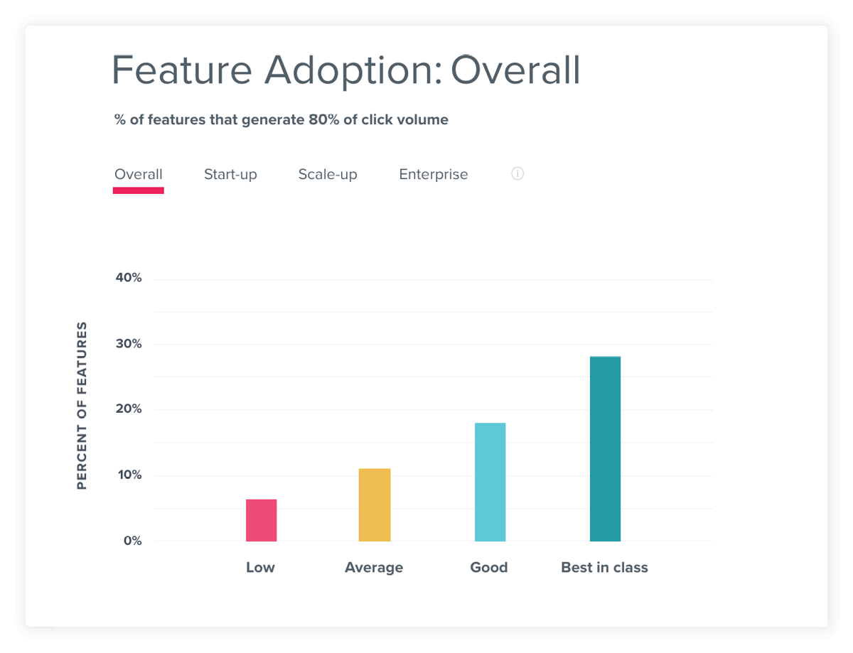
Source: Pendo Product Benchmarks; Feature adoption is measured as the percentage of features that generate eighty percent of click volume.
User stickiness
User stickiness measures how many users return to the product on a regular basis.
This engagement metric looks at frequency of usage, and can be calculated by taking daily active users (DAU) as a percentage of monthly active users (MAU). While users might need to use a product once a month to check a statement or complete a process, well-adopted products provide additional functionality or value that encourage customers to use the product more frequently and develop routine, habitual use. You can also measure stickiness as the percentage of monthly users (MAU) that return weekly (WAU).
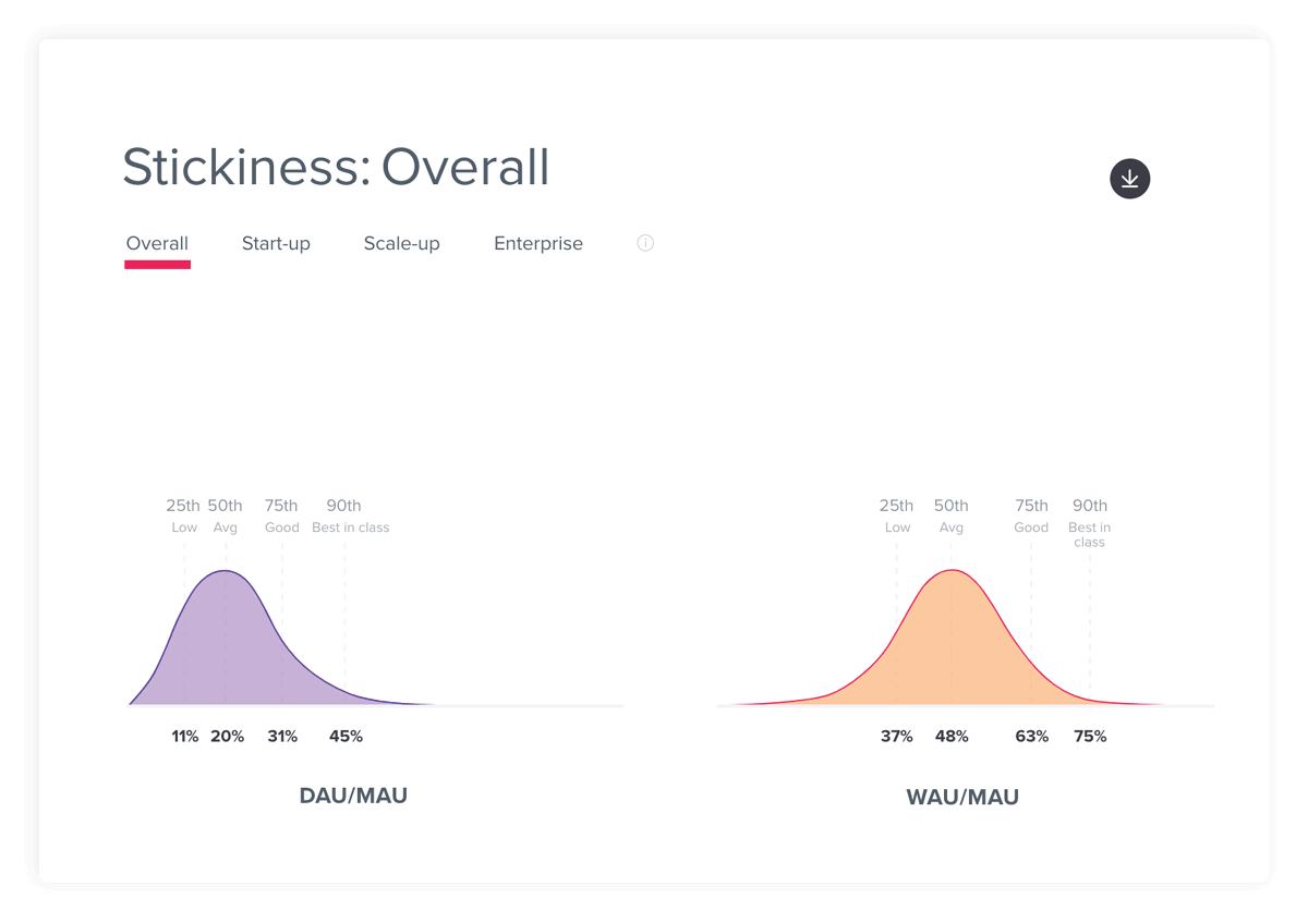
Source: Pendo Product Benchmarks
App retention
App retention measures how many users continue using an application over a given period of time.
When looking at retention, it’s especially useful to study first time users. High retention rates indicate that first time users are able to discover enough value to keep using the product, while low retention can indicate that users aren’t finding the product useful, or aren’t motivated to keep coming back. One way to measure this is by tracking the percentage of users retained in the first three months of usage.
A key reason for improving retention is the impact it has on growth. Since growth is the net effect of your user acquisition and user retention efforts, the more you can retain users, the faster your user base will grow.
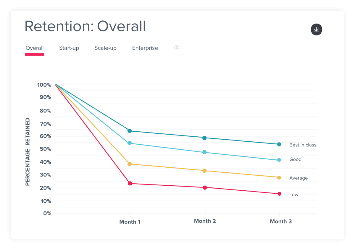
Source: Pendo Product Benchmarks
The product engagement score
While measuring feature adoption, user stickiness, and growth separately is useful, it can be even more valuable to measure them in aggregate. The product engagement score (PES) provides a singular view into product engagement, enabling PMs to easily (and quickly) assess how a product is performing.
The composite score is made up of the three metrics, defined as:
- Adoption: The percentage of users or accounts using key features in your product, represented by any or all of your Core Events
- Stickiness: The 30 day rolling average of the percentage of monthly active users who return either daily (DAU/MAU) or weekly (WAU/MAU)
- Growth: You user or account growth rate for the chosen time period, compounded to the annual growth rate
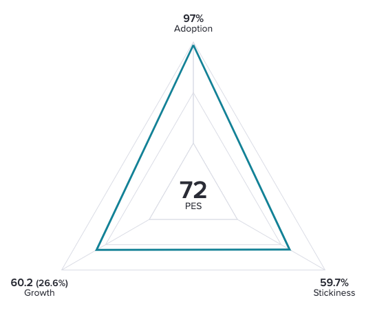
To calculate your PES, simply take the average of the three numbers. From there, you can dig into the different components to understand which metric may be throwing off the average, or why your PES increased or decreased over time.
2. Collect baseline usage data
Generating the adoption metrics highlighted in the previous section requires a strong foundation of product usage data. Here are some key components to track:
- Aggregate user data (e.g. how many users log in each day)
- Feature-level data (e.g. how many users visit a certain page or use a given feature)
- User metadata (e.g. descriptive information about each user)
Note: User metadata is critical to conducting comparative segmentation, or the ability to study how usage differs between users with different titles, roles, or locations.
Who should manage data?
To calculate your key adoption metrics, assess the data and analytics capabilities your team possesses. Some larger organizations may have existing analytics tools or a business intelligence (BI) system managed by a data science or other shared services team. Determine if this team can provide the support you need, or if you require an analytics tool specific to the product org.
If your team will manage its own data, you’ll have the choice between a traditional, instrumented
analytics tool and modern codeless platforms. Here’s a quick comparison of the two:
Instrumented analytics
- Owned by data science, and requires support from engineering for implementation and maintenance.
- Can provide highly customizable, granular levels of tracking.
- Data is only collected after features are tagged, so teams must wait for results to accumulate before questions can be answered.
Codeless analytics
- Owned by the product team, and can be implemented and updated by line of business owners.
- Can provide more nimble, agile analysis.
- Can collect all on-page user interactions automatically, so data is already available when features are tagged. Analysis can happen right away.
Since it allows for more agile analysis and better cross-team collaboration, many companies that historically relied on traditional analytics tools are starting to leverage codeless analytics. Once you have identified and procured the right product analytics tool, the next step is to dig into the data.
3. Explore user journeys
As you collect product usage data, work with your team to come up with hypotheses about what typical and ideal usage journeys look like. This will help you make sense of your data and approach it with specific questions in mind. Here are some questions to consider:
- Which features are most important to delivering customer value?
- What are the key workflows or actions that a user should complete?
- How do those workflows evolve throughout a customer’s lifecycle?
- What are our most used features?
- Do these most used features align with our expectations?
- What’s missing from the list of top features, and what top-used features are surprising?
Then, when you have enough data to analyze, compare your predictions to real user behaviors. When your expectations are different from reality, explore why with user path analysis. A user path is the click journey to or from a certain feature or page in your application. You can use it to answer questions like “where do users go after they view the dashboard?” or “how many steps does it take to run a report?”
Workwave wanted to understand how users were interacting with high-traffic pages in their app. After analyzing user journeys, they found that their reporting workflows were much longer than they expected, taking six to seven clicks on average. They used this data to prioritize building a new “Quick Search” feature that cut down the workflow to just two clicks.
Two ways to understand user journeys
Funnel: Shows how users travel through a defined sequence of in-product actions. Useful for conversion rate optimization and analyzing workflows.
Path: Shows all user click sequences before or after a specified action. Useful for uncovering real user behaviors and understanding what users do when they don’t follow expected journeys.
Analyzing user paths will help define existing workflows in your application, and can shed light on why certain features are used more or less than you’d expect. For example, a feature that’s important or valuable but buried behind a long menu or click sequence will be harder for users to find and use.
To illustrate this process in practice, imagine you’ve been tasked with improving free trial conversion rates. You might start by running a feature adoption report to compare the usage of customers who convert with the usage of customers who churn. In that report, you see several core features that are used heavily among customers with successful trials, but not used by customers who don’t convert.
With this data, you hypothesize that those features are part of the value users need to see before they’re willing to pay. So, now you need to explore ways to improve awareness and adoption of those features, which is the topic of the next section.
- Compare top paths of key personas like admins vs. users
- Compare paths of users who have and have not used a key feature
- Compare paths of users who were and were not retained after 90 days
- Compare paths of users with higher an lower engagement frequency
4. Deliver in-app guides and messaging
An effective tactic for raising awareness of key features and influencing user behaviors is communicating with users in-app. These messages can be targeted and triggered by demographic or behavioral characteristics, and are the best way to reach customers when the information you’re sharing is most relevant. There are dozens of use cases for in-app messaging and guides, but the most common for teams to start with are user education, feature awareness, and onboarding.
User education
User education campaigns are useful for:
- Clarifying confusing language and labeling
- Guiding users through unfamiliar UX flows
- Reinforcing key business processes
- Reducing support tickets or help requests
Many organizations turn to in-app messages to provide additional context or answer common questions, which can lead to improved usability as well as support ticket deflection. While these messages can take many forms, the most common UX pattern for simple user education use cases is an inline tooltip. These can be triggered when the user hovers over a field or icon that indicates additional context is available.
When designing tooltips, it’s critical to:
1. Keep the copy short–it should be more like a short
tweet rather than a long paragraph
2. Link out to supporting documentation or help articles
3. Design them to stand out from your application (e.g. by using contrasting colors)
4. Make sure they don’t block any related text or user actions
Where should you start with tooltips? Using your product usage analytics, look at the click paths before users contact support. This will show the pages and features that drive the most ticket volume, and if there are any quick wins you can implement.
Common UX patterns for guides
In-app guides can be delivered in several different formats. Here are four of the most common types:
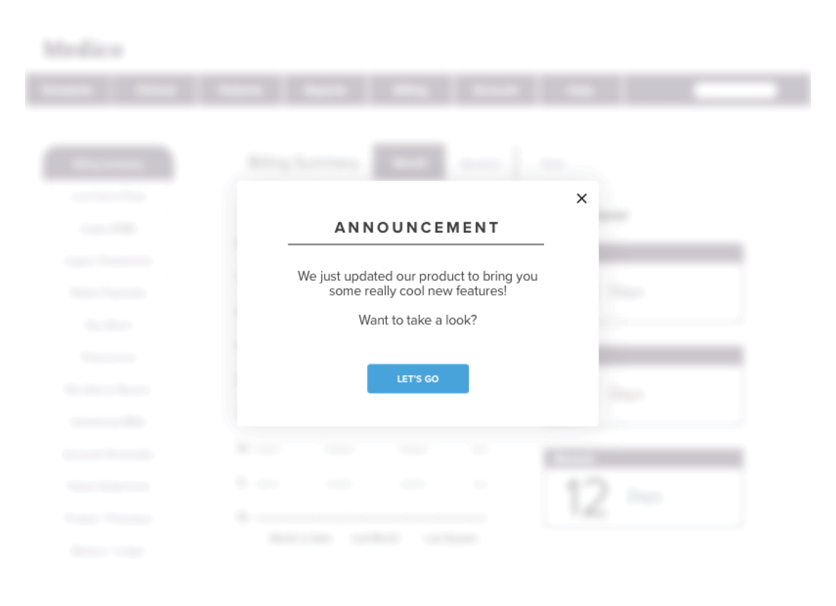
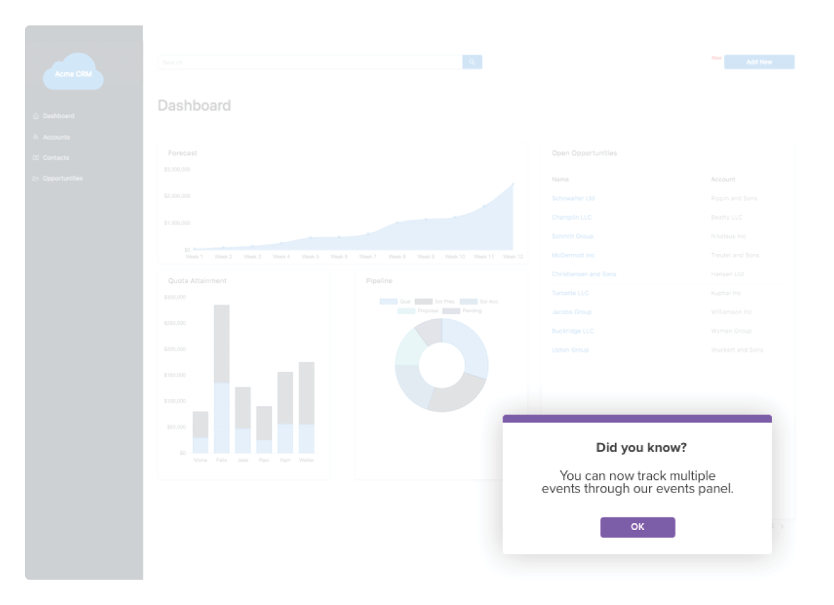
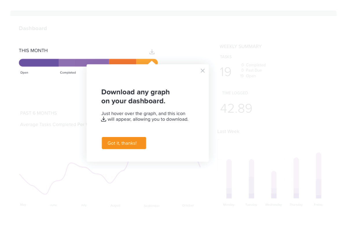
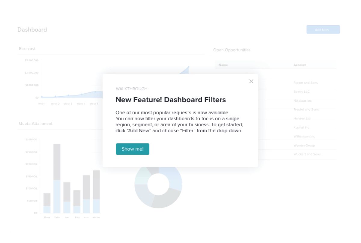
Lightbox: a dialog box that displays as an overlay on your app to draw the user’s full attention. They usually appear in the center of the screen, and may dim or block background content to force engagement. Lightboxes can be very effective, but should be used sparingly.
Toast: a small dialog box that displays in the corner of the user’s screen and does not block interaction with the main app. It can self-dismiss after a period of time, or persist until the user interacts with it. It’s called a “toast” because early versions would pop up like slices of bread from a toaster.
Tooltip: a small text box that appears when a user hovers over an icon, link, or other element in an app’s interface. They can also be used with badges, which are small icons that display next to the element to indicate a tooltip is available. Tooltips are one of the least intrusive UX guide patterns.

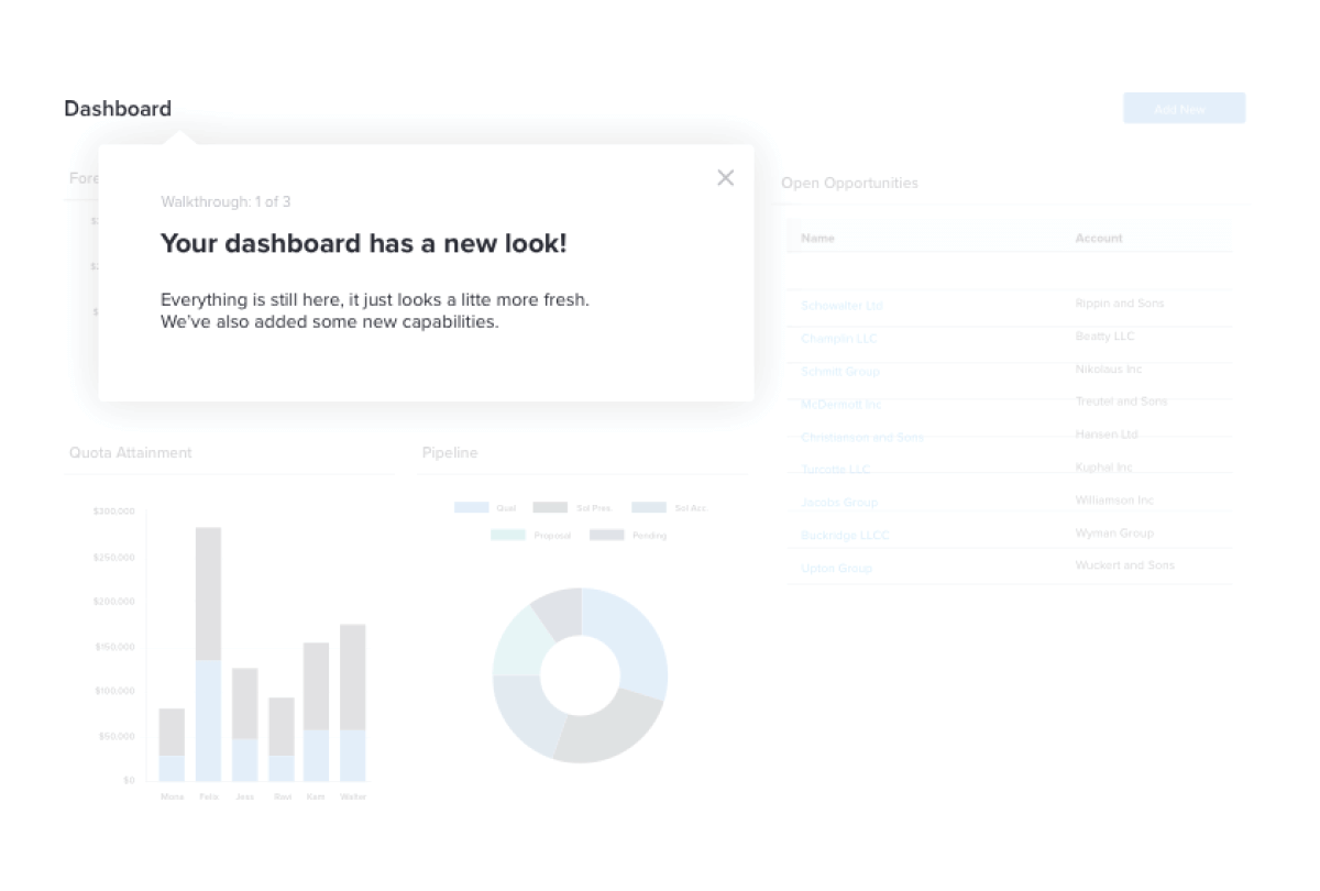
Walkthrough: a multi-step series of messages that guides a user through a workflow or task. The tooltip pattern is most commonly used for individual steps, but other UX patterns are useful at the start or end of the sequence. Short sequences are most effective, as users tend to drop off after six or more steps.
Feature awareness
Feature awareness campaigns are useful for:
- Encouraging users to explore different parts of your product
- Launching a brand new feature
- Introducing an existing feature to users who haven’t tried it yet
- Helping users discover new value from your product
Since they are meant to grab the user’s attention, feature awareness campaigns tend to use the lightbox UX pattern, which displays in the middle of the screen and sometimes dims the backdrop behind the guide. Some teams prefer a less intrusive toast style guide, which displays in the corner and allows the user to continue to use the app without dismissing the guide. Most teams also design these guides to trigger automatically after the user logs in, or when they visit the page the intended feature is on.
To effectively drive feature awareness with your in-app guides, be sure to:
- Use images, GIFs, or short embedded videos
- Emphasize the benefits of using the feature
- To optimize test different versions of copy user engagement
Finally, think through how you’ll measure the success of your campaign. An initial spike in usage is a good sign, but it’s more important to develop users who come back to the feature regularly and make it part of their ongoing usage. Consider looking at retention at the feature level to understand the long term effectiveness of your campaign.
Onboarding
Onboarding campaigns are useful for:
- Introducing new users to the product
- Explaining more involved workflows
- Reducing reliance on customer success teams to manually onboard
Onboarding campaigns are designed to introduce new users to your app’s navigation, key features, and workflows. When in-app onboarding is done correctly, it speeds up a new user’s time to value, steers them toward the right features, and ultimately impacts retention–while also taking some of the burden off of your customer success organization.
The most common UX pattern for onboarding guides is a multi-step walkthrough. These guides can launch automatically during a user’s first visit, or can be self-launched from a menu. This guide menu–sometimes called a Resource Center–allows users to revisit relevant guides if they need a reminder on how to do something in your application.
As you build out your in-app onboarding campaign, keep these tips in mind:
- Order your onboarding steps in a logical sequence and give users a sense of progress (e.g. with a progress bar).
- Make each onboarding segment as short as possible. User engagement drops off significantly on walkthroughs with more than six steps.
- Use checklists to take advantage of the brain’s natural tendency to want to complete things.
- Don’t worry about users learning everything in your app–get them comfortable with navigation and introduce the key habits that will keep them coming back.
Planning for scale
As you develop your in-app messaging strategy, think about creating guidelines around who can request and publish guides. Many organizations set up a review and approval process for in-app messaging to ensure consistency in the language used in guides, visual design, audience management, and scheduling.
This responsibility can live in a technical documentation team, or more commonly includes cross-functional support from marketing, UX, design, and often a product operations group. It’s also important to create some rules around guide frequency, and employ controls to limit how many guides a user can see in a given time window.
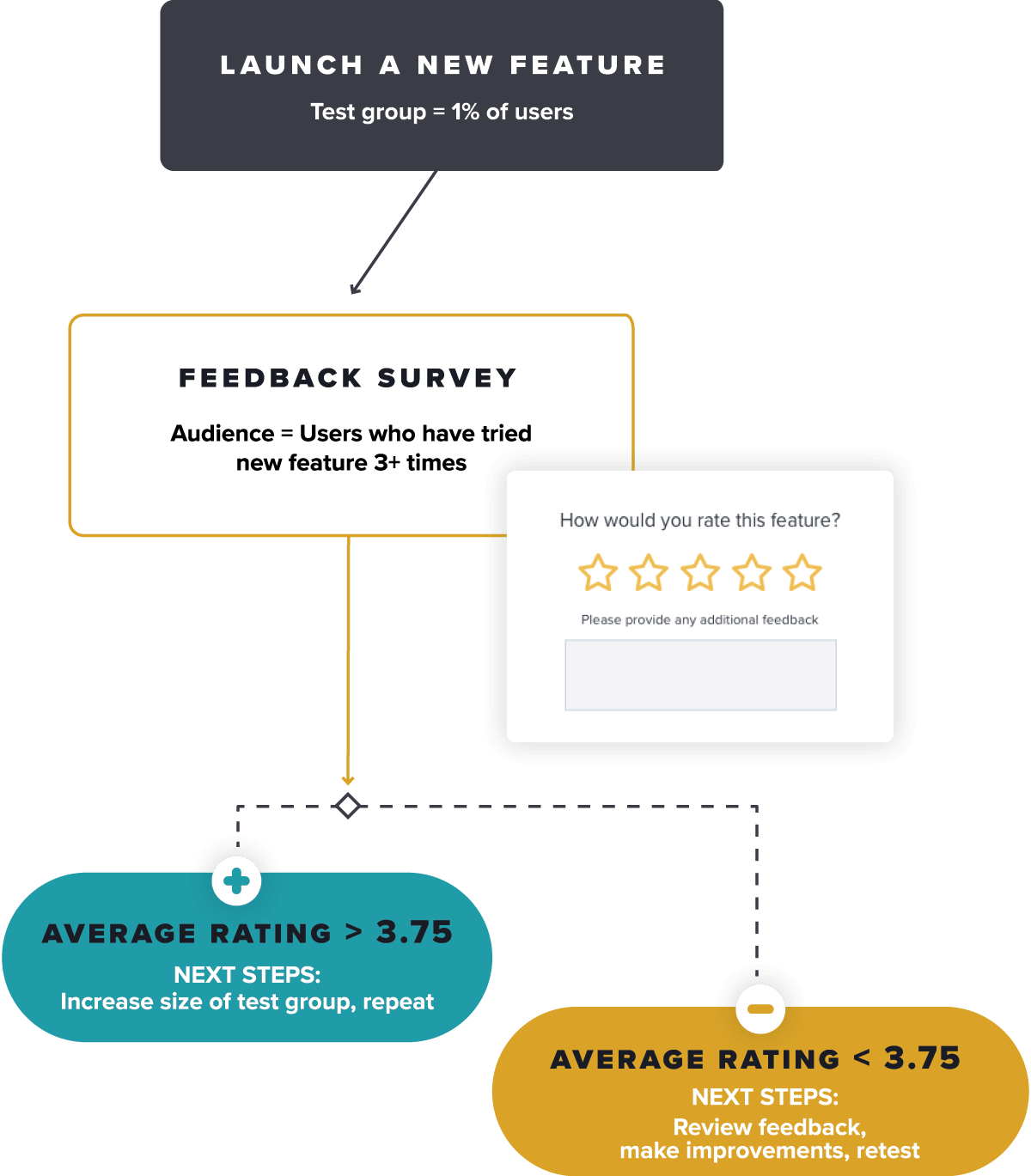
5. Develop user sentiment and survey programs
To truly understand the drivers behind product adoption, quantitative usage data must be paired with qualitative data from user surveys. It’s one thing to know how customers navigate your product–it’s another to understand what they want and need from it (aka what will help improve their adoption of it).
Similar to the one-way messages we explored in the previous section, you can deliver user surveys inside your application and target specific segments of users. These survey programs help measure experiences and perceptions that can’t be captured in basic usage data, and can be used to better understand users in a certain segment of interest. In this section, we’re going to cover two main types of survey programs: metrics-focused and project-focused.
Metrics-focused: always-on campaigns used to measure changes in user experience or sentiment over time.
Project-focused: designed to collect specific feedback in support of a discrete initiative.
Metrics-focused survey programs
Metrics-focused survey programs are useful in measuring changes in perception and experience across your user base over time. They are generally considered a lagging indicator, and include surveys like Customer Satisfaction (CSAT), Net Promoter Score (NPS), and UX measurements like System Usability Score (SUS).
These programs should be as inclusive as possible–you don’t want to introduce bias by excluding potential participants, except to respect customer communication preferences and individual opt-outs. While participation should be as broad as possible, analyzing the results by narrower segments (like role or persona) can help uncover insights that might not surface when looking at the responses in aggregate.
Measuring and reporting changes in the numerical metric from these surveys is key, but it’s more important to understand the “why” behind individual responses. This will help you uncover potential changes you can experiment with to improve your metric and ultimately, your customers’ experience with your product.
Be sure to include an open-ended text question like “Why did you give this rating?” to allow respondents to provide context for their score. Regularly review that feedback, and cluster responses by product area or functional capability. This will allow you to see if there are any specific reasons behind dissatisfied user responses you can address, and measure changes in those response themes over time.
Finally, consider layering product usage analytics with your survey responses to see if any specific pages or features are correlated with positive or negative user feedback.
Project-focused survey programs
Project-focused surveys are a tactical method to investigate findings from your high level experiential surveys or to support key programs. One excellent example is to support user research. Imagine you notice a trend among admins who are frustrated with user management in your application. You may want to get additional input from these users, or even recruit participants for research panels or usability tests.
Using in-app surveys, you can efficiently gauge interest in participation with a simple yes/no poll and deliver a link to a calendar scheduling page in one streamlined workflow. In contrast to always-on surveys that cover your entire user base, you’ll want to only deliver these invitations to the target role (admins) who regularly access your user management feature. Additionally, some research teams use in-app guides to embed prototypes or wireframes of proposed features to collect user feedback at scale.
How to learn more
Now that you’ve reviewed the foundational components of measuring and improving product adoption, it’s helpful to understand how to apply these ideas in context. Here are two ways to get started:
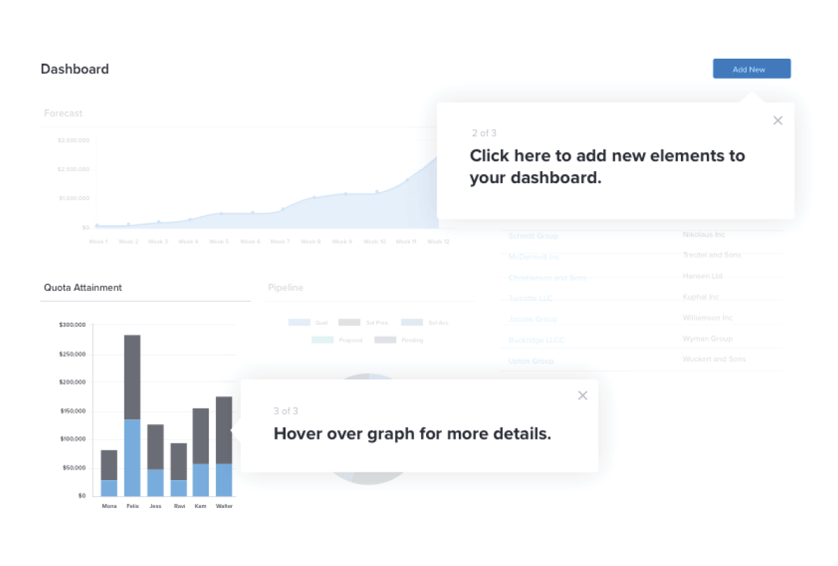
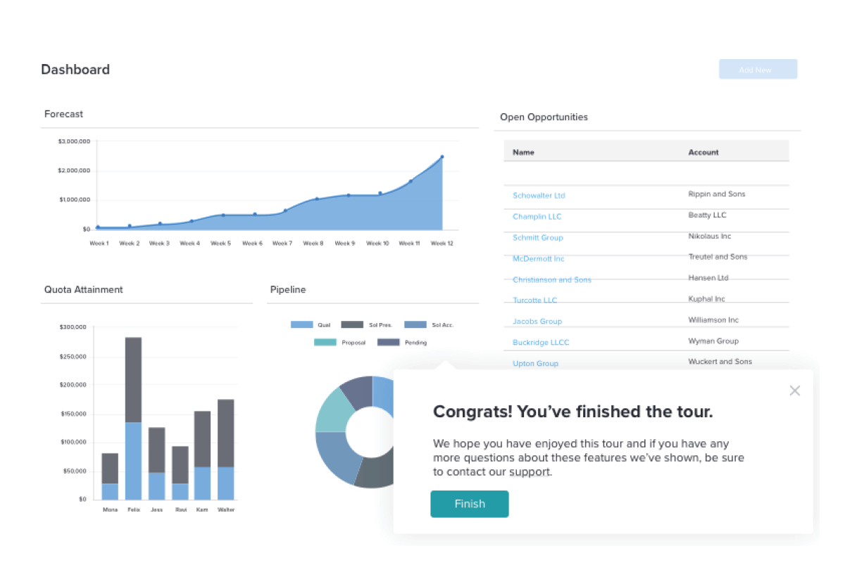
1. Take a self-guided tour of Pendo: Explore how to evaluate product usage and leverage feature adoption metrics to understand which parts of your product are driving engagement.
2. Get a personalized product engagement assessment: We’ll walk you through a series of questions to better understand how you might measure product engagement, and provide you with the tools you need to optimize it.