You may not have heard of the phrase “guide sprawl” before, but if you’ve ever had a frustrating (or infuriating) experience with in-app messages, you’ve probably experienced it.
Put simply, guide sprawl is what happens when in-app messages — specifically guides, for us Pendo users — are not created in a consistent way, resulting in a chaotic product experience. It could mean the messages all look and feel different or that they appear too often, not often enough, or at the wrong time.
Why is guide sprawl such a big problem?
A lack of consistency in any application (whether it’s in the content itself, the sequencing, or other components) is going to cause dysfunction for your users. Users use your application to accomplish something, and any unfamiliar or unrelated information to that task can be frustrating and, frankly, annoying.
If you give users too much information to process at one time or present that information in a confusing way, at best, their attention will go elsewhere. At worst, they’ll be left feeling confused, frustrated, and no longer interested in using your product. One of the biggest things we can do to give our users a positive user experience is to reduce the cognitive load in our application, and how you implement Pendo is a great place to start.
Procore’s journey with guide sprawl
At Procore, we first realized how much our in-app messages were impacting users after running an NPS survey and seeing multiple comments about our in-app messages. The feedback spanned the not-too-bad (“I didn’t purchase Procore to have ads”), the bad (“…leave me alone long enough to actually use your product”), and the ugly (“I can’t get my job done because you keep interrupting me”). Now, it’s important to note that these comments were on an NPS where users could have commented about anything, and our in-app messages are what they chose to focus on. This meant we had to re-think the way we messaged our users in-app.
The plot twist came when we asked users how they prefer to hear about changes to the product — and nearly 60% of the thousands of users surveyed said that in-app messages were the best way to inform them of new features.
From these two surveys, it became clear that while our users were frustrated with how we were displaying our in-app messages, they were still the best method of communicating product changes with our users. We didn’t need to get rid of in-app messaging, we just had to display them better.
Fast forward several months, and after creating guidelines to enforce consistency around guide creation, I couldn’t help but wonder how we ever functioned without them. Though specific needs, budget, and ownership will be different from my company and product to yours, here’s what I learned from using Pendo to tackle guide sprawl at Procore.
Tip #1: Establish clear ownership
In the past, we had one team (myself and some other members of technical documentation) that had permissions to create and publish in-app messaging. However, we were just executing; requests streamed in from other departments (marketing, product, engineering, and customer success), all which provided their own design/content for in-app messages.
This workflow left us with a huge ownership gap. There weren’t clear roles set regarding who was in charge of what, and so the time between idea and publishing was on average 2 weeks. That two-week gap wasn’t the biggest problem we faced though. The biggest consequence came after an in-app message was published. Neither the requestor nor technical documentation thought it was their job to maintain and QA in-app messages, so weeks after a guide was published, it usually broke without anyone being aware of it.
What we learned from this is that creating in-app messaging is a multi-disciplinary task, and ownership should be clearly defined between each step of the creation process. Consistency in ownership and process played a huge part in how effective guides turned out to be in our product.
Tip #2: Involve the right stakeholders
Establishing ownership is all about involving the right people. To best achieve this, we created a Pendo “strike team,” which was a cross-departmental team of stakeholders to support our in-app messages consistency initiative.
Each member of the strike team lent their perspective and what role they would take on. In the initial stages of getting Pendo set up, members of the strike team helped create the guidelines and processes as it applied to their role (e.g. QA will test guides before they go out and after they are published to make sure they don’t break, and design and engineering will create and maintain our guide templates).
Tip #3: Think through the 5 Ws
Creating guidelines that drive consistency in how we use Pendo probably plays the biggest role in preventing guide sprawl at Procore. Though all guidelines will be unique to the company that builds them, Procore’s guidelines answer the following questions:
- What (#1): First and foremost, we put together guidelines for what our company does and doesn’t use Pendo for, and the different types of guide components we use. Once these were clearly established, it prevented teams from “going rogue” and creating guides that are out of scope for our product.
- Why: To go along with the first “what,” we put together reasons why each type of communication should be used, plus why we shouldn’t use others for certain scenarios.
- What (#2): Once we had the what and why established, I worked with our UI and engineering teams to build templates that help ensure consistency across all of our guides. From there, I built out a knowledge base with resources on how to build the guides in Pendo, as well as design and content guidelines to follow.
- Where, When, Who: Since guides can appear virtually anywhere in the product, we needed clear rules around where we do (and don’t) display different types of in-app messages, as well as when they will appear and who should receive each type of guide.
Tip #4: Prioritize consistency over everything
Even when you’re deep into mapping out processes and creating detailed guidelines, always remember that the ultimate goal is ensuring your in-app guides are consistent.
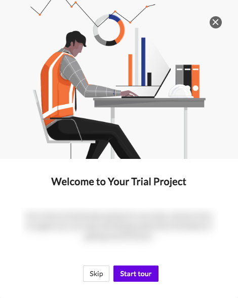
In the past, the design and content of our in-app messages were all over the place. Now, we are constantly thinking through ways we can create consistency between guides presenting similar information, even in small ways. For example, we color-coded each type of guide so users can recognize information more quickly.
 |
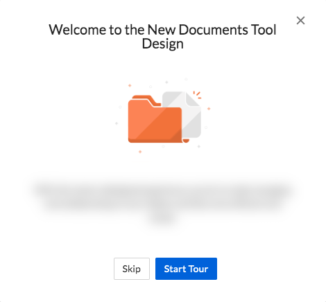 |
| Purple buttons are used for onboarding, trial, and anything training-related. | Blue buttons are used for new features and any non-urgent announcements. |
Tip #5: Iterate as you go
Like many things in product, you’re not necessarily going to roll out a perfect plan to eliminate guide sprawl. Yes, building out the first draft of your guidelines will take time, but don’t be afraid to release it into the wild once you get a tested minimum viable product. In fact, to this day I’m continuously improving our processes, most recently by adding videos to our documentation after receiving feedback that a visual step-by-step would be easier to understand.
You will always be able to (and should) make improvements as you go based on feedback. For me, I love when new employees join the team, since it gives me the opportunity to put the guidelines in front of fresh eyes. New employees are the best at pointing out instructions that aren’t clear or a process that needs to be revisited.