An effective in-app onboarding strategy is made up of many different parts, but the real magic happens when they work together to welcome, guide, and educate users who are new to your product. One way these parts come together is through an onboarding walkthrough. Instead of users landing in your application for the first time with no sense of which features or areas to explore first, in-app walkthroughs allow you to curate their experience and guide them through the workflows they should know about right away.
Walkthroughs are similar to product tours, but instead focus on a specific task, feature, or workflow rather than giving a high-level overview of the whole product. The other key differentiator is that during walkthroughs, users can interact with your product and the guides at the same time. This means users can learn by doing, increasing the likelihood that the information will stick and they’ll have a clear understanding of how to utilize a given area of your product.
If a product tour feels too broad for your product (or you want to supplement it), onboarding walkthroughs are a great way to deliver helpful, in-context information specific to each user’s needs (more on personalization below in Step 6). So, once you’ve started planning your onboarding strategy at a high level, it’s time to narrow in on the specifics. Which features should users learn how to use first? How can you best guide them through this experience?
Use this guide (no pun intended) to build an in-app onboarding walkthrough that’ll leave your new users empowered and excited to engage with your product effectively.
Step 1: Determine what your walkthrough will show
Just as it’s a lot harder to write a two-page essay than it is to write a ten-page essay, narrowing down what your onboarding walkthrough will show isn’t as easy as it sounds. Luckily, you can take a data-driven approach to choosing which features to highlight (learn more in this playbook). By anchoring walkthroughs around the features or workflows existing users access the most and/or you know are associated with success, you’ll be able to ensure new users find value in the product as quickly as possible.
As a rule of thumb, we recommend keeping your onboarding walkthroughs to four or five steps. If you’re creating a walkthrough that goes beyond this threshold, consider splitting it up into multiple walkthroughs so that you don’t overwhelm new users with too much information at once.
Step 2: Select layouts for your guides
After you’ve chosen where your walkthrough will guide users, it’s time to think about the how. You’ll likely be able to choose between different in-app guide layouts, and the best onboarding experiences are made up of multiple guide types, each one serving a key purpose.
Here are some guide layouts you might consider:
Lightbox: These types of guides often dim or darken the rest of the page to emphasize (and draw users’ attention to) what’s on the guide. It can be useful to use a lightbox for the first step in your onboarding walkthrough as a way to grab users’ attention and signal that the information is important. Since they offer more space than other guide layouts, lightboxes are also beneficial when you have more text or want to elaborate on a specific step in the workflow.
Tooltip: A more subtle type of guide, tooltips are in-app messages that appear when users navigate to a specific area or perform a certain action in the product. In the context of onboarding, tooltips are particularly useful because they don’t block the entire page, allowing users to read the information and see the feature the tooltip is referring to at the same time.
Banner: A banner is an in-app message that’s aligned to the edge of the browser or phone screen. Similar to tooltips, the rest of the screen usually remains clickable when banners are on the page. Since they don’t necessarily appear directly next to a given feature, banners are a good way to end an onboarding walkthrough, especially when they include a link to additional resources where users can learn more about what they just saw.
Poll: While it might not seem obvious, onboarding is a great time to gather feedback from your users. For example, you can include a poll in your walkthrough asking users if they think a given feature will be useful to them. This feedback will help you continue to improve your onboarding experience and ensure you’re delivering the most helpful information to new users.
Learn how to use in-app guides to build personalized onboarding by taking a self-guided tour of Pendo.
Take a tour ->Step 3: Build your walkthrough’s content
Once you have a sense of which guide layouts you’ll use, move on to the content that will appear on the guides themselves. Beyond simply labeling what a feature is or where to find it, include text that explains the value and why users should access this area of the product. When applicable, include any links to additional resources or even a video that explains the task or feature in more detail.
It’s also useful to storyboard the flow of your entire walkthrough so you can make sure all of the information you want to share is covered and it follows a logical order. When it comes to the text on these guides, use language like “let’s” and “we” to foster a more personal tone and put yourself in the onboarding flow with users. Additionally, write as clearly and concisely as possible–onboarding walkthroughs aren’t a time to ramble.
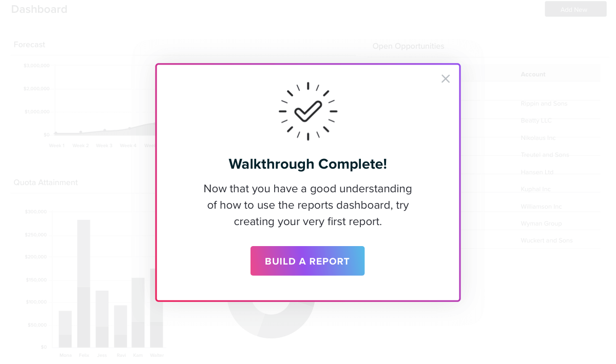
Pro tip: Consider adding a final step in your onboarding walkthrough to congratulate users on completing the walkthrough and generate excitement around exploring more areas in your product. These small moments add a lot to the onboarding experience, and users will appreciate the personal touch.
Step 4: Choose an activation method
After choosing your guide layouts, think through how you want these guides to activate. Generally, there are three options for activation:
Automatically: Automatic guides will appear when a user arrives on the page the guide is anchored to. This type of activation is best used for the first step in your onboarding walkthrough, ensuring users will see the guide and don’t have to take any actions to trigger the informational content.
Badge: Guides that are activated via a badge appear after a user clicks or hovers over a badge icon. Badges help avoid cluttering the user interface, and are great for more passive tooltips that you want users to access only if they need the additional information.
Target element: These guides activate when a user clicks on the feature or page that the guide is anchored to. Target element guides are especially useful for onboarding walkthroughs that highlight specific features, allowing you to call attention to these product areas and guide users to click on them.
Similar to guide layouts, be sure to utilize a variety of activation methods–this will help keep users engaged throughout the onboarding experience you’ve created for them.
Step 5: Target your walkthrough to the right users
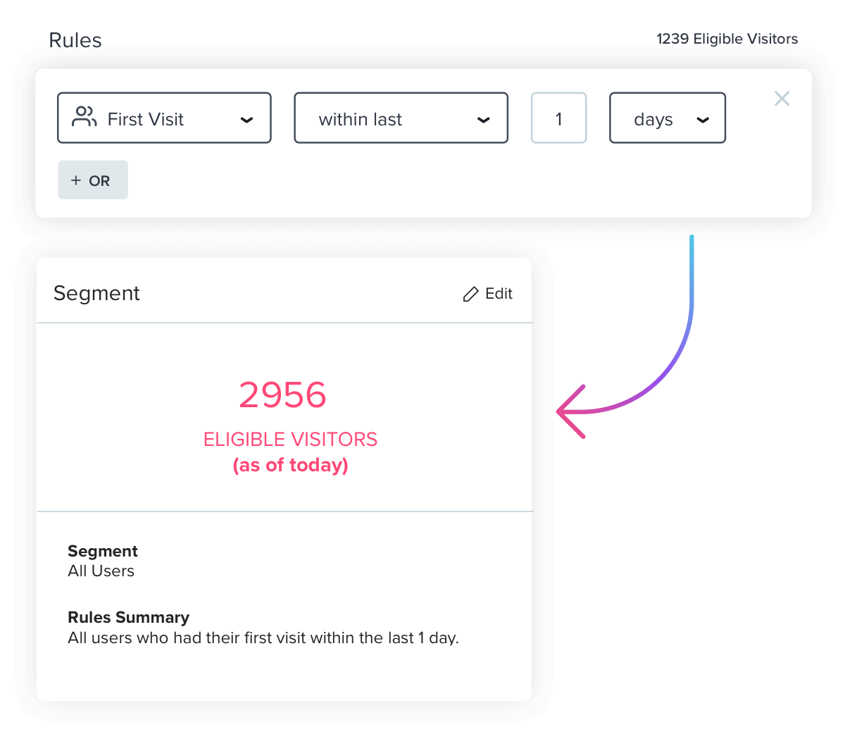
Part of creating an effective onboarding walkthrough is ensuring the right users are exposed to it. When you’re done building out the content, set up the proper targeting by creating a segment for the group of users you want to see your walkthrough. You can build segments off of a variety of metadata or product usage data points, but in this case, you should start with a rule like “First visit within last 1 day” to target only users who are new to your product.
Step 6: Don’t stop at one walkthrough
Congratulations! You’ve built your first onboarding walkthrough. Here’s the best part: Your work shouldn’t end here. The beauty of in-app onboarding is that product data and segmentation allows you to create multiple onboarding tracks specific to different subsets of your user base. Once you’ve created this initial walkthrough, spend time mapping out how you can personalize new users’ experience even further and create additional walkthroughs based on user personas, use cases, or otherwise.
This will enable you to provide hyper-relevant information to new users based on what you already know (and continue to learn) about them. New users will appreciate the personalization and, more importantly, be better able to get the most out of your product.