
Inhaltsverzeichnis
- Introduction: The move toward intelligent, data-driven in-app guides
- 1. Do: Use data to inform your guides strategy
- 2. Don’t: Pack your guides with too much content
- 3. Do: Leverage guides for a variety of use cases
- 4. Don’t: Target all your users with the same guides
- 5. Do: Capture the customer voice through guides
- 6. Don’t: Build guides that feel disconnected from your product
- 7. Do: Think of your guides as part of a holistic experience
- 8. Don’t: Create guides with no end point
In a rush?
Download the PDF for later
Introduction: The move toward intelligent, data-driven in-app guides
When you need to reach customers right away, the last thing you want is your message getting overlooked in a crowded email inbox or lost in translation. In reality, the best place to communicate with your users is already right in front of you—the product itself.
With in-app guidance, product, customer success, support, and marketing teams can reach the right users, with the right message, at the right time. What’s more, guides are the ultimate way to take action on the product data you’re already collecting and analyzing.
Did you learn that a certain feature is seeing less-than-stellar adoption? Create an in-app guide to steer users toward that feature.
Need to make sure a certain segment of your user base completes a specific workflow? Add tooltip guides to proactively answer the questions your support team hears most often.
These are just a couple examples of leveraging in-app guidance software to act on product analytics.
While guides have the potential to greatly improve your product experience, guides gone wrong can quickly overshadow any positive impact. Without the right strategy, in-app guides can actually hurt the product experience—think: guides that stay up too long, overwhelm the user interface (UI), or include too much or too little information.
At Pendo, we know there’s a better way. Teams need to take a strategic approach to in-app guides, using data to create guides that are helpful, impactful, and drive the right behaviors in the product. Throughout the rest of this e-book, we walk through eight essential dos and don’ts for building in-app guides that do just that—going beyond gut instinct and truly elevating the experience users have with your product.
Tauchen wir ein.
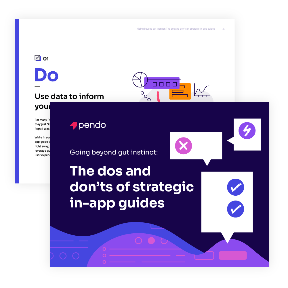
1. Do: Use data to inform your guides strategy
For many PMs, customer success leaders, and marketers, they just “know” what will resonate with users and customers. Right? Well, kind of.
While in some cases it might be clear when you need an in-app guide to explain a new feature or get information to users right away, there are likely plenty of other opportunities to leverage guides to achieve a certain outcome or improve the user experience—you just don’t know about them (yet).
Rather than relying on gut instinct alone to power your guide strategy, data should be the foundation of every phase: planning, implementation, and iteration. And since guides are an excellent tool for quickly learning from your users and changing their behavior, every in-app guide should have a hypothesis driving it. Pendo in-app guides is perfect for just this!
Lean on product usage data
Product usage data is a goldmine of information about your users—where else can you learn what users are actually doing in your product? Users may say they need one thing, but their usage could tell a completely different story.
Depending on a specific guide’s goal and purpose, you can use product data to determine who to serve it to, where in the product it should live, and what content it should include. For example, if you’re building an onboarding walkthrough, first use data to identify the behaviors of your most successful users. Then, build an onboarding experience that walks new users through those areas of the product or offer quick tips to users who have already engaged with a certain feature but haven’t yet mastered it.
You can also examine usage data to uncover any places where users are dropping off in certain workflows, and then create guides that provide contextual help and steer those users to the desired action. If you’re launching a new feature that complements an existing feature, product data can tell you which users are already accessing the existing feature, and therefore would find value in this new one.
An experimentative approach to guides
Once you’ve used data to create guides that will be relevant and impactful to your users, the work doesn’t end there. It’s equally important to measure the performance of your guides to understand if they’re doing what they’re supposed to do. Has adoption of that feature improved? Are new users staying engaged in the product beyond day one? Are you seeing clicks on your guide CTA?
If you’re able, make sure to set a conversion goal for every guide you create (when applicable). Then, carve out time in your team’s workflow to go back and analyze guide performance and make any necessary adjustments. Maybe it’s a matter of changing the segmentation (more on this in Section 4), making the guide copy more clear, or putting the guide in a new place in the product entirely. It also might make sense to remove the guide altogether. When you view in-app guides through this experimentative lens, you’ll be better able to create the product experience your users deserve—and expect.
2. Don’t: Pack your guides with too much content
Creating successful in-app guides is both an art and a science. If you remember one thing, though, it’s this: don’t overcomplicate your guide’s content. Above all, you want in-app guides to be helpful, informative, and delightful. Too much text or confusing language can actually deter users from reading and learning from your guide in the first place.
Here are some expert tips for building guides that add to (and don’t detract from) the overall product experience:
- Keep the copy short. Space is limited in an in-app guide, so focus on including key information and linking out to additional resources as needed.
- Use simple, direct language. Write in active voice and always be mindful of your audience—don’t use internal language or technical jargon your users might not understand.
- Include relevant CTAs. Be mindful of where your guides lead your users, and make sure to include links to any relevant resources or key next steps.
- Incorporate visual elements. Guides don’t have to be text-only. In-app guides with images, GIFs, and videos drive better engagement—so think through where and when these visual elements make sense.
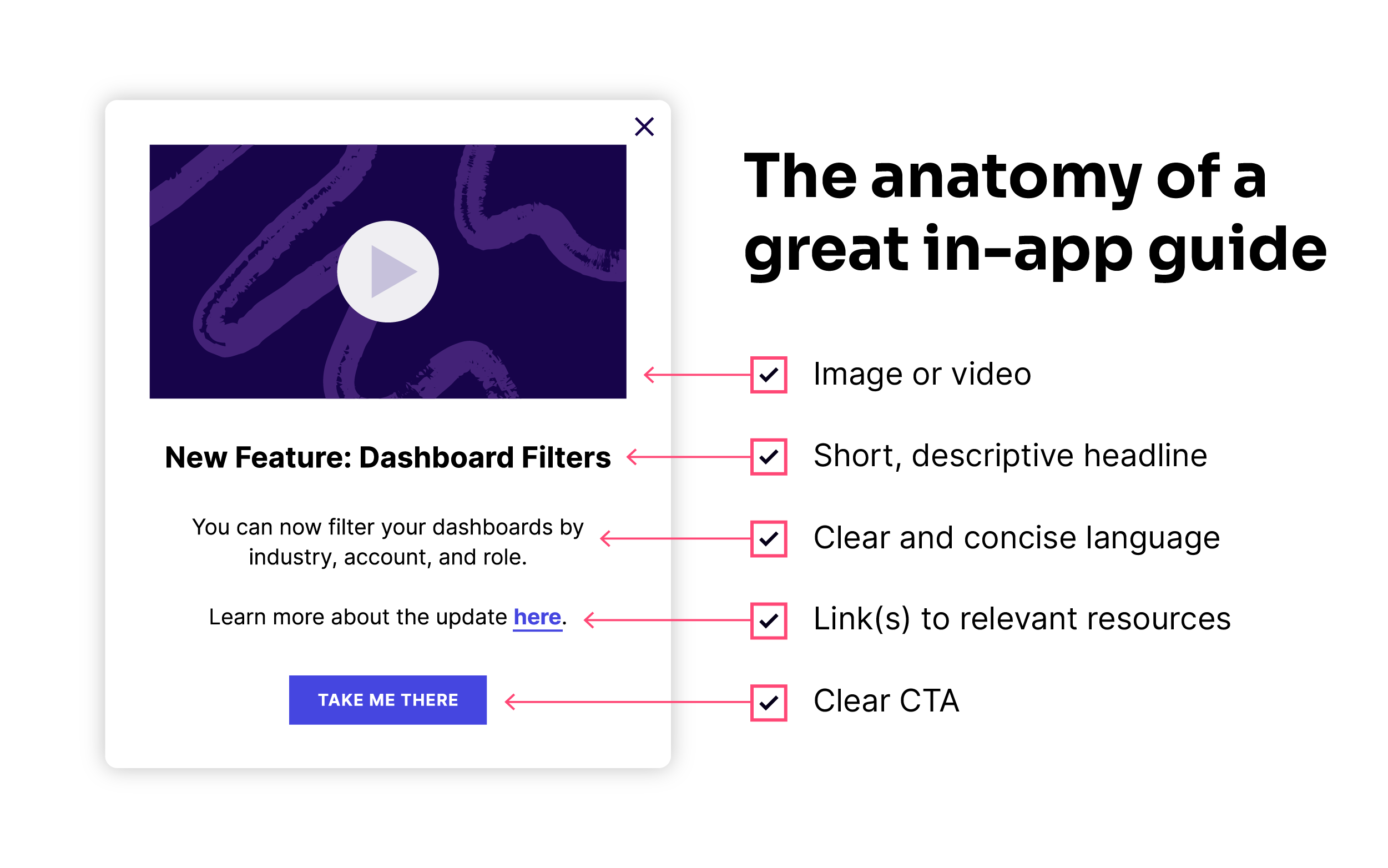
How long should your guide copy be?
- Tooltips: Contextual tooltips should include roughly two lines of text. These should be short and sweet—closer to a tweet than a full paragraph.
- Lightboxes: Keep these pop-up guides to around one paragraph, or four lines of text. Pro tip: use bullet points to organize the information in a lightbox guide (and keep each to a single line of text).
- Announcements in a resource center: If you have a resource center in your product where you can share announcements and on-demand guides, err on the side of short and sweet here as well. Above all, don’t make the user have to scroll just to read your post. And be careful with images since they take up vertical space, and can be hard to read in this small of an area.
For the visual learners out there, here’s a look at the components of a great in-app guide:
3. Do: Leverage guides for a variety of use cases
When it comes to in-app guides, the number of ways to utilize them are nearly endless. Even if you start using guides for a very specific reason, don’t forget to consider all the other ways you could leverage them inside your product.
Here are some of the most effective ways we see teams across organizations using in-app guides:
Onboarding
Rather than delivering onboarding via a series of emails or resource-intensive live sessions, your product is the perfect vehicle for serving up this key first experience for your users. Whether you opt for a single-page onboarding experience, user-initiated onboarding, or a full interactive walkthrough, in-app guides allow you to provide contextual information as new users navigate your product, helping them utilize the functionality that’s most relevant to their needs right off the bat.
Feature announcements / adoption
What better way to tell users about new features (or encourage them to utilize existing ones) than while they’re already interacting with your product? Communicating about these features in-app means users can instantly click to start exploring and using them, eliminating the friction that comes with feature announcements sent via email or through a one-to-one conversation.
Customer communications
When you need to reach customers immediately, there’s no better channel than your product itself. This is especially important for time-sensitive messages, for example if you need to let users know about a bug or outage. With in-app guides, you can ensure users not only see this information, but that they see it when it’s most relevant to their needs.
Free / free trial conversion
If you have a free version of your product and/or offer free trials, in-app guides are useful not only for communicating with these users, but also leading them down conversion paths. Think through where you can utilize in-app guides to educate free users about paid features, and direct them to where they need to go to upgrade.
User education
Beyond the initial onboarding experience, in-app guides offer a way to continue educating users about key areas of your product. If you see users getting stuck in a certain area (or hear common themes from your support team), add tooltips to preemptively answer questions or walkthroughs to help reinforce ideal workflows.
Marketing campaigns
Your marketing team is likely already leveraging a variety of promotion and distribution channels, but your product should be added to—and pushed to the top of—that list. From webinar and event promotions to expansion and referral programs, in-app guides are a great way to add moments of delight to your users’ experience and raise awareness for your most important marketing campaigns.
Feedback
In-app guides aren’t just a way to communicate information to users—they’re highly useful for collecting valuable information from users, too (we dig into this more in Section 5). In-app polls and surveys (e.g. NPS surveys) provide an easy way to learn both what your users think and how they feel about your product without disrupting their workflows.
4. Don’t: Target all your users with the same guides
You likely have multiple types of users who access your application—people with different job titles, account levels, browser types, app versions, and (most notably) varying needs from your product. Your in-app communications should account for these differences, and segmentation is the way to make it happen.
When in doubt, segment
Segmenting your user base allows you to tailor in-app guides to users’ specific needs and ensure the information you deliver is always hyper-personalized and relevant. Depending on the tool you’re using, you should be able to segment by user metadata and users’ actions in your product. Both factors are important, and certain segmentations are particularly useful for specific use cases.
Here are some examples of ways to target your in-app guides:
- Target NPS Promoters with guides asking for customer testimonials or participation in beta programs or user testing
- For feature improvement announcements, target users who used the feature in the last 30/60/90 days
- Deliver guides to your free or free trial users as a channel for converting them to paying customers
- If you’re retiring a feature, target any users who are still using the feature to let them know it’s going away, and what workflow or product area they should use instead
- Customize onboarding guides based on a user’s role (e.g. job title or admin vs. general user)
- If a feature has low adoption, serve guides to users you know would find the most value in the feature
5. Do: Capture the customer voice through guides
As you build out guides that share information with users or point them in the right direction in the product, remember that in-app guides can be a form of two-way communication. By collecting feedback in-app, you’re able to reach users when their experience with your product is top of mind—making them more likely to respond, and respond honestly.
Here are a few ways to leverage guides to collect feedback:
- Use in-app polls to ask users if they think a new feature or product will be useful to them
- Create a one-question survey for users to fill out after their support case is closed
- Serve Net Promoter Score (NPS) surveys to users in-app at key moments in their workflows
- Provide an always-on place in your product for users to submit feedback when it’s convenient for them
Feedback is fuel for innovation
In-app feedback is also an effective way to learn about your users (and their experience with your product) quickly, test new ideas, and, ultimately, hone in on the right areas of focus.
Let’s say you just launched a brand new feature (congratulations!). In addition to tracking product usage to understand who accessed the feature, for how long, and when, in-app guides allow you to take action on that data. For any users who utilize the feature, you could serve them an in-app guide that asks them what they thought of this new functionality, if there’s anything missing, or how you can improve it. This gives you instant insight into your users’ thoughts and opinions, allowing you to start iterating on the new feature right away.
6. Don’t: Build guides that feel disconnected from your product
Rather than thinking of in-app guides as an addition to your product, you should really think of them as an extension of your product. This means paying close attention to the look and feel of your guides, and being strategic about where you place them.
Keep design top of mind
Any in-app guides you create should look and feel like they’re part of your application. When done right, your users should never actually know that an in-app guide wasn’t built by your engineering team like the rest of your product. There may be some cases for special branding, for example if you want to grab users’ attention with a big announcement, but generally speaking it’s best to stick to preexisting brand guidelines. This way, users will instantly associate the guide with your company and product, making them much more likely to pay attention to it.
Process makes perfect
With anything that calls for consistency, ensuring your guides adhere to brand guidelines will require some good old cross-functional collaboration to develop the right processes and workflows for your organization.
First, work with your product and brand design teams to identify guide design guidelines (no pun intended) to ensure a consistent look and feel. From there, you’ll want to put together a process for guide creation. Who owns writing the copy? Who should approve the segmentation? Who will play the role of air traffic control to make sure guides aren’t competing with each other? Consider building a cross-departmental tiger team—with representatives from product, design, product marketing, and product ops—to own and execute your in-app guide strategy. More importantly, try to establish this team as early as possible—it’s a lot harder to backtrack and try to create order from chaos.
7. Do: Think of your guides as part of a holistic experience
Although each in-app guide you create will have its own unique purpose, don’t think of guides as one-off experiences or projects. Especially as you build out more and more, remember to always consider how one guide will impact the others that already exist. For example, if you’re planning to create an in-app guide to drive adoption of a certain feature, check to see if there are any current guides tied to that feature or that appear close by in the UI. This is when segmentation becomes especially crucial, since you can target your guides to avoid overwhelming any one user with too much information at once.
Similarly, thinking about your guides as part of a holistic experience also means placing them in strategic locations. In fact, an in-app guide can (and should) live in multiple places within your product to ensure users see it when it’s most relevant to their workflow.
Let’s say you just launched a brand new feature that you want users to know about and utilize. If you initially place an in-app guide on your product’s homepage (e.g. to grab users’ attention right when they log in), think through other areas of your product where this feature would be relevant. Are there any places where pain points might surface and where this particular feature could help? In this case, using more subtle guides—like tooltips—is an effective way to deliver information to users without taking over their entire screen or distracting them from their intended actions.
Mix up your guide types
As you work to create in-app guides that feel cohesive, build off one another, and improve the product experience, make sure you’re utilizing a variety of guide types. Here are five key types of guides to keep in mind:
Banner
 A banner is an in-app guide that is aligned to the edge of the browser window or phone screen. The rest of the screen usually remains clickable when banners are on the page, so they are good for more general product announcements or to direct users to a resource with more information about a given topic.
Lightbox
 Also referred to as a “pop-up” or “modal,” lightboxes often dim or darken the rest of the page in order to emphasize the guide’s content itself (some lightboxes even prevent users from interacting with the rest of the page until they dismiss the message). Since a lightbox can be intrusive to the user experience, they’re best for important notifications that require acknowledgement from users immediately.
Tooltip
 Tooltips are in-app guides that appear when users navigate to a specific area or icon or perform a certain action in the product. They are especially useful for providing in-context support or help with a certain feature since users can read the information and see the feature the tooltip is referring to at the same time.
Interstitial
 An interstitial guide displays between two screens or pages in the user’s workflow. These are commonly used for maintenance announcements or important feature updates, and are most frequently placed between a product’s login screen and home screen or main dashboard.
Walkthrough
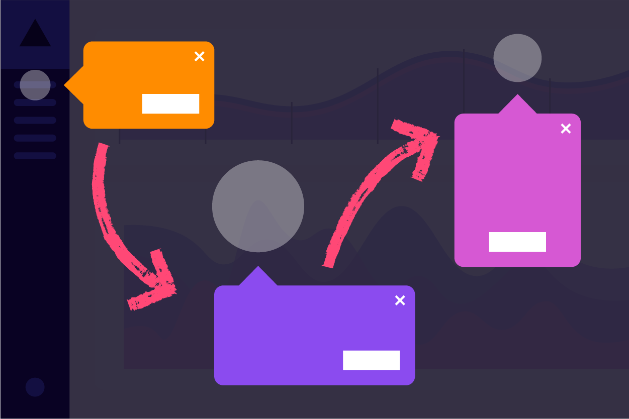 A walkthrough is a multi-step guide that can be made up of multiple guide types (e.g. lightboxes and tooltips). As the name suggests, these are meant to walk users through a certain action or workflow, and are particularly useful for onboarding.
8. Don’t: Create guides with no end point
All good things must come to an end, and this includes even the best in-app guides. While it might seem intuitive to make a guide last forever (the more information we give to users, the better, right?), truly strategic guides have a clear purpose and therefore, a clear ending point.
Timing is everything
Take, for example, a guide that’s meant to drive feature awareness and adoption. There should come a point where you’re able to clearly see whether or not the nudge impacted users’ behavior. Depending on the results, it’ll make sense to retire the guide, iterate and improve it, or keep it as-is for another set period of time. Even more imperative is to remove guides from your product that include timely announcements, product updates, or information about a recent bug. The last thing you want is for a guide that’s meant to be helpful to end up confusing or frustrating your users.
One guide’s end is another’s beginning
Just because a guide’s time in your product ends doesn’t mean it’s not useful anymore. What can you learn from this guide to inform the next one? For example, if you learn something about users or their feelings about your product (e.g. through their response to a poll or interaction with a guide’s CTA), use a second in-app guide to dig deeper and better understand how you can improve their product experience.
Guides aren’t always the answer
Similarly, it’s easy (and often effective) to use in-app guides as temporary fixes for problematic UX or development oversights. But in some cases, a guide isn’t actually the right solution to the problem. As you’re examining a guide’s performance and determining how long it should be active, make sure you ask the question: “Is a guide the right strategy here?” This mindset will help ensure you’re using guides for the right reasons and, more importantly, always working to build the best product possible for your users.