
From manual and scattered to scalable and centralized
Companies have more ways to stay close to their customers than ever before—from measuring product usage, to running surveys, to collecting feature requests, to tracking Net Promoter Score (NPS) and customer satisfaction (CSAT). The tricky part, though, is ensuring stakeholders across the organization have access to this data and can effectively use it to improve the customer experience at every phase. Pendo helps make this process seamless and scalable.
As the director of customer insights at Foreground, a platform that connects families and individuals with photographers, Dave Shay is focused on providing a holistic data set that the product team can use to inform decisions and improve their work. “My hope is to empower [the product team] with as much data as I can so that when they’re designing new functionality and moving the product forward, they’re doing so in a way that’s really focused on customers’ needs,” Shay explained.
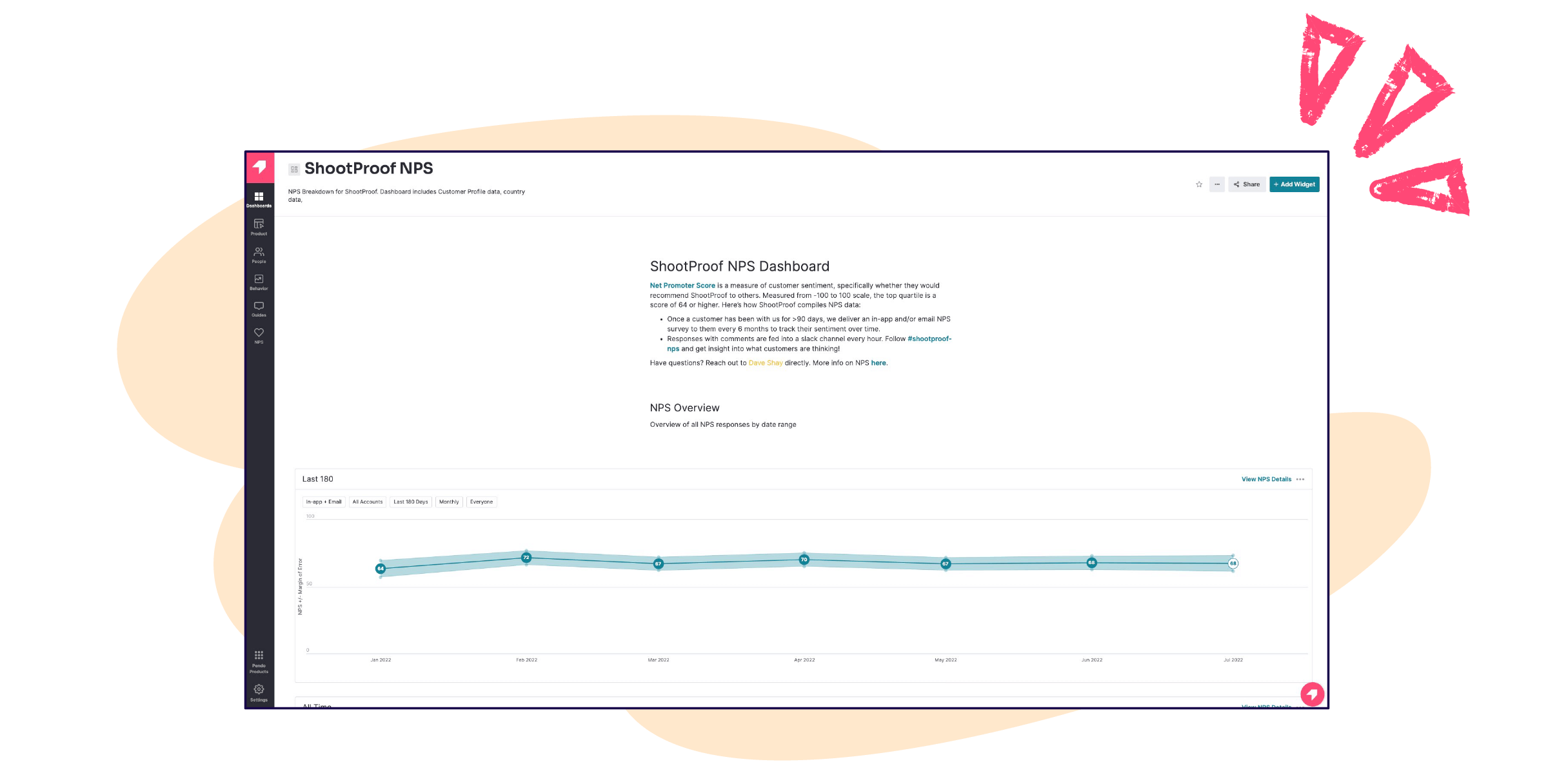
In the past, this required quite a bit of manual work, since data was scattered in multiple places and things like slide decks and spreadsheets needed to be created or updated each month. As a first step, Shay made a point to bring all of this data into Pendo to give it a single, centralized home. “A core part of my job is making sure we have a central location for people to go to for data on a particular product, launch, or initiative, and Pendo Dashboards have been crucial for that,” said Shay.
Where numbers and stories collide
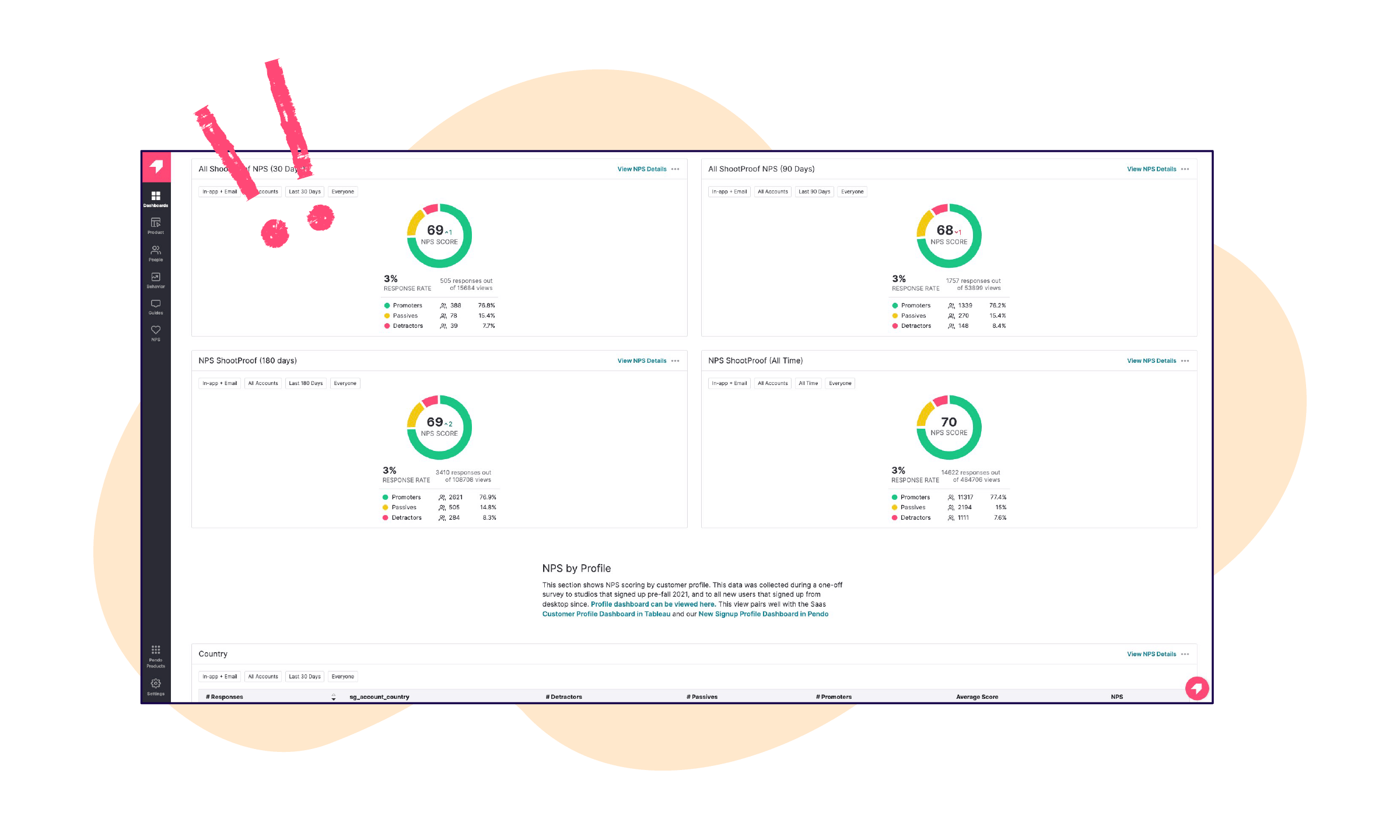
The benefits of centralizing data proved particularly valuable when Foreground released a new payment gateway for their customers. The product team started to notice a decline in onboarding and in-app engagement, so Shay created an in-app guide to collect information from new users that could help bolster their engagement strategy. “The guide popped up as soon as somebody logged in for the first time and asked questions you’d expect to see when you sign up for a new account,” Shay explained. “We were able to start learning about our users right away, and for the first time we could see differences across personas at scale.”
Shay then added the profile information he collected to a Pendo Dashboard, which made it easy for anyone in the company to view data for the last seven, 30, and 90 days. More importantly, they could use these insights to inform their strategy. Shay noted, “For example, if we know that last July we saw an increase in family photographers using our platform, this year we can tweak our marketing to target that group, since we saw an influx organically last year.” Shay also included the Feature Use by Visitor widget on the dashboard, where team members could see which features were being used by different user segments. If usage for a particular segment seemed off, the team could dig in and even create an in-app survey to understand why users were getting stuck in certain places.
After sharing the dashboard with his team, one of the first things Shay noticed was the types of questions he started getting. “They started asking all sorts of questions that they’ve never asked before,” he said. “To me, that was a sign of success.” This also helped shape Shay’s strategy for building dashboards. Now, he’ll create a dashboard, share it, and then spend the next two to three weeks adding to the dashboard based on the questions he gets asked. “If I were to say what Pendo Dashboards have given us the ability to do, it’s to empower curiosity throughout our organization,” said Shay.
In addition to bringing multiple data points into one place and enabling team members to self-serve, Pendo Dashboards have also helped Foreground stay laser-focused on their customers. For Shay and team, what’s most useful about dashboards is that they can present “the numbers and the stories” right next to each other. “If I launch a feature and see ‘X’ number of people use it, that’s great,” said Shay. “But if I can also see results from the survey users receive after using the feature for the first time, that’s where I learn if the feature is truly delivering value. Seeing survey responses right next to usage data really helps hold our team accountable.”
Shay also noted how pre-dashboards, each team member looked at every piece of data through their own lens. Now, by including multiple data points together—quantitative and qualitative, high-level and in-the-weeds—it’s easier to keep everyone grounded to the holistic data set within the dashboard itself. As he put it, “This has really helped with alignment, because oftentimes in organizations, you have people who are very detailed thinkers and you have people who are more big picture thinkers. Some people love their quantitative data, and some love their qualitative data—but getting everyone access to all of those data points together is what really makes an impact.”
The final benefit Shay highlighted is the ability to better meet customers’ changing needs. “We’ve been able to be flexible because we understand our customers better with the knowledge we’re pulling out of Pendo,” he said. “Two months from now we might see that the industry shifts again. And I like to think that we will know about it before our competitors, because we are constantly paying attention to our customers this way. It puts our customers at the center.”