
Contents
- Introduction: the multi-screen era is here
- How are my customers using web and mobile?
- What does multi-screen product usage mean for my business?
- How can I shape product usage and the related customer outcomes?
- What does usage mean for my multi-screen product strategy?
- Thriving in the multi-screen era with Pendo for Mobile
In a rush?
Download the PDF for later
Introduction: the multi-screen era is here
Statistics say that at least 25% of you are reading this on a smartphone. The number of software interactions that occur on mobile is quickly increasing, but it’s equally important to note that 90% of users will move between devices to complete a task. This desire to interact across multiple devices or screens applies not only to content consumption, but also to any company with a digital product. In the multi-screen era, businesses must provide users with a digital experience that enables them to seamlessly interact, transact, and buy across web and mobile applications.
With user preferences leaning more and more towards mobile applications, companies are forced to take a harder look at how user expectations vary between web and mobile experiences. For example, users expect and value short session lengths in mobile apps whereas users expect to explore more of the product and perform more complicated tasks in a browser experience.
With customer expectations unique to each screen, companies may be tempted to evaluate and strategize for their web and mobile products separately. This approach, however, ignores the reality that most users – and often, your most loyal users – combine web and mobile in a single product journey. By thinking about your web and mobile apps in isolation, you could be missing some of your most important customer insights.
When it comes to multi-screen experiences, companies should always evaluate these four questions:
- How are my customers using web and mobile?
- What does multi-screen product usage mean for my business?
- How can I shape product usage and the related customer outcomes?
- What does usage mean for my multi-screen product strategy?
If you’re a data-driven team and prioritizing engagement as a top-line objective, answering these questions ensures your product is on track to becoming an engine for core business outcomes.
How are my customers using web and mobile?
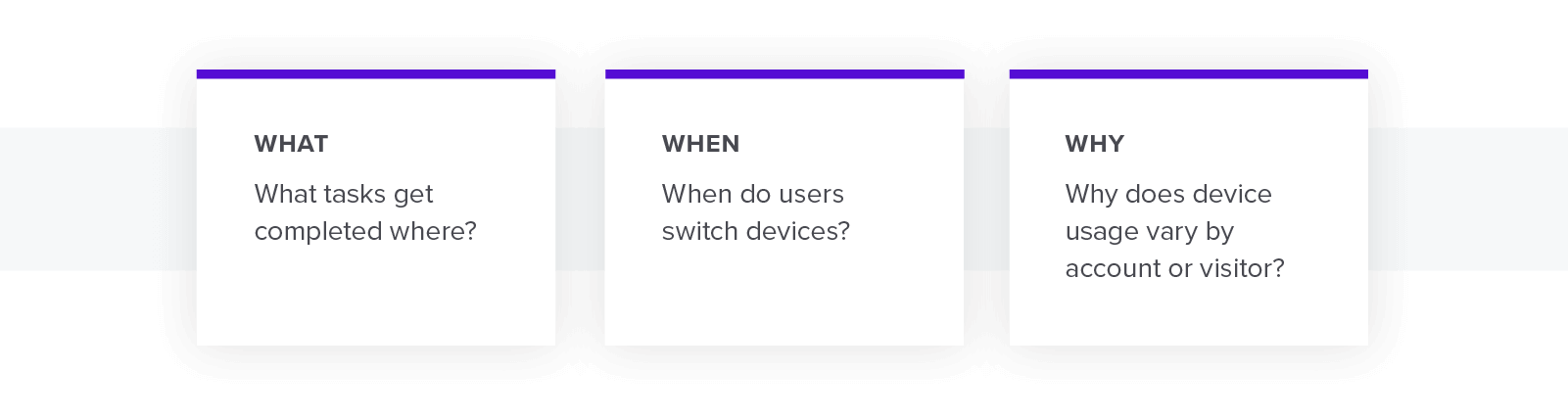
Before you can begin to make changes to your multi-screen experience, you must first diagnose what your current user experience looks like across web and mobile. This requires understanding the what, the when, and the why of product usage:
Please fill out the form below to read the rest of this white paper
WHAT TASKS GET COMPLETED WHERE?
While potentially obvious, it’s important to know which features users adopt on mobile and which they adopt on web. Without a product analytics tool, it can be practically impossible to gather this type of data. In addition, if you are using separate tools for web and mobile, it can be an extremely manual effort to consolidate the data into a single, actionable view.
Having the ability to dive into mobile or web-specific data or create one comprehensive view
to compare the two experiences is critical to understanding where your product succeeds and where it creates friction in the customer journey. With comprehensive product analytics that track clicks, page views, and events at the account and individual level, you can have a complete view of what parts of your mobile and web experiences users embrace and which they ignore.
Questions to examine include:
- What are my most and least popular web features and pages?
- What are my most and least popular mobile features and pages? Do these vary by app version?
- How do my Daily Active Users (DAU) and Monthly Active Users (MAU) vary by device?
- For tasks that are available across web and mobile, are there tasks that get completed significantly more often on one device?
- Which accounts and users are my web power users?
- Which accounts and users are my mobile power users?
WHEN DO USERS SWITCH DEVICES?
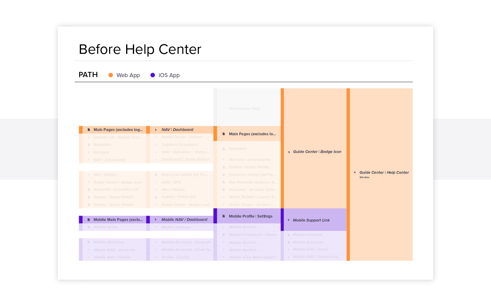
The first step in evaluating your current product experience is understanding how your product is used differently across web and mobile. But it’s equally important to identify what causes users to switch from one device or another. This can be easily visualized with paths and funnels.
A path is a visual representation that allows you to discover what steps users are taking to accomplish tasks and access different elements or features in your product. Paths will show you how users are navigating within your product as well as which device they are using to complete these clicks. Identifying common areas where users tend to switch devices may indicate areas of friction in your product or places where your user journey may be too complex. This becomes particularly helpful for mobile applications, given the additional value mobile users place on ease of use and short screen times.
For example, by creating a path to HELP button, you can see which features on each device are most likely to result in a user seeking additional support. In performing this analysis, you may also identify cumbersome workflows and pinpoint opportunities to eliminate unnecessary steps and clicks that are causing confusion.
Funnels let you define the steps you want users to take in your application and provide a more quantifiable view of how often users are actually taking the desired path. For example, if you want a user to start at your Home page, then click on feature A, followed by clicking on feature B, funnels tell you if they actually did that.
Discovering funnels where users aren’t following what you believe to be the ideal path can help you identify workflows that require additional research or re-working. Funnels can also validate or disprove your assumptions around when users feel the need to switch from web to mobile or vice versa.
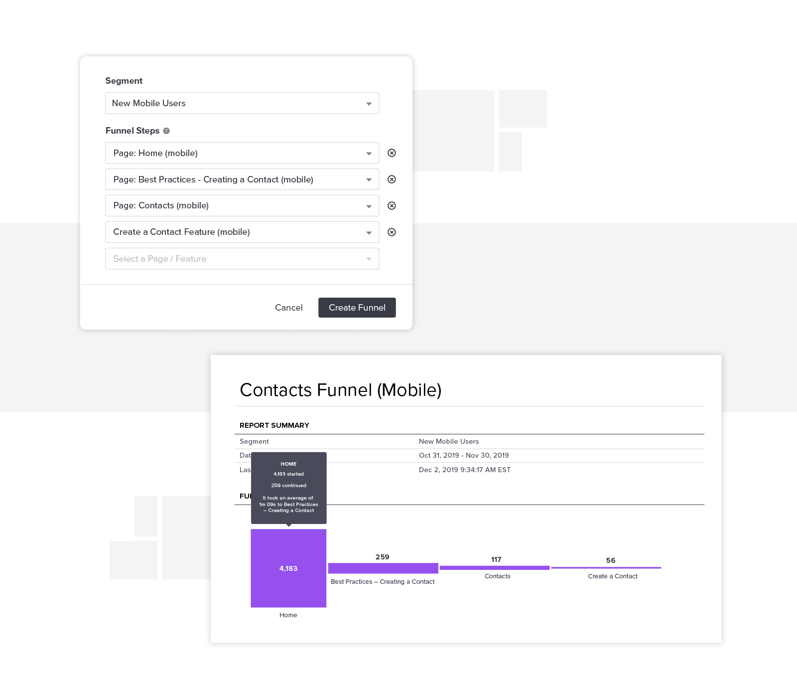
By combining current product usage with the actual paths users take in your products, you get a more complete, quantifiable view of where your product succeeds and where it fails to meet customer expectations.
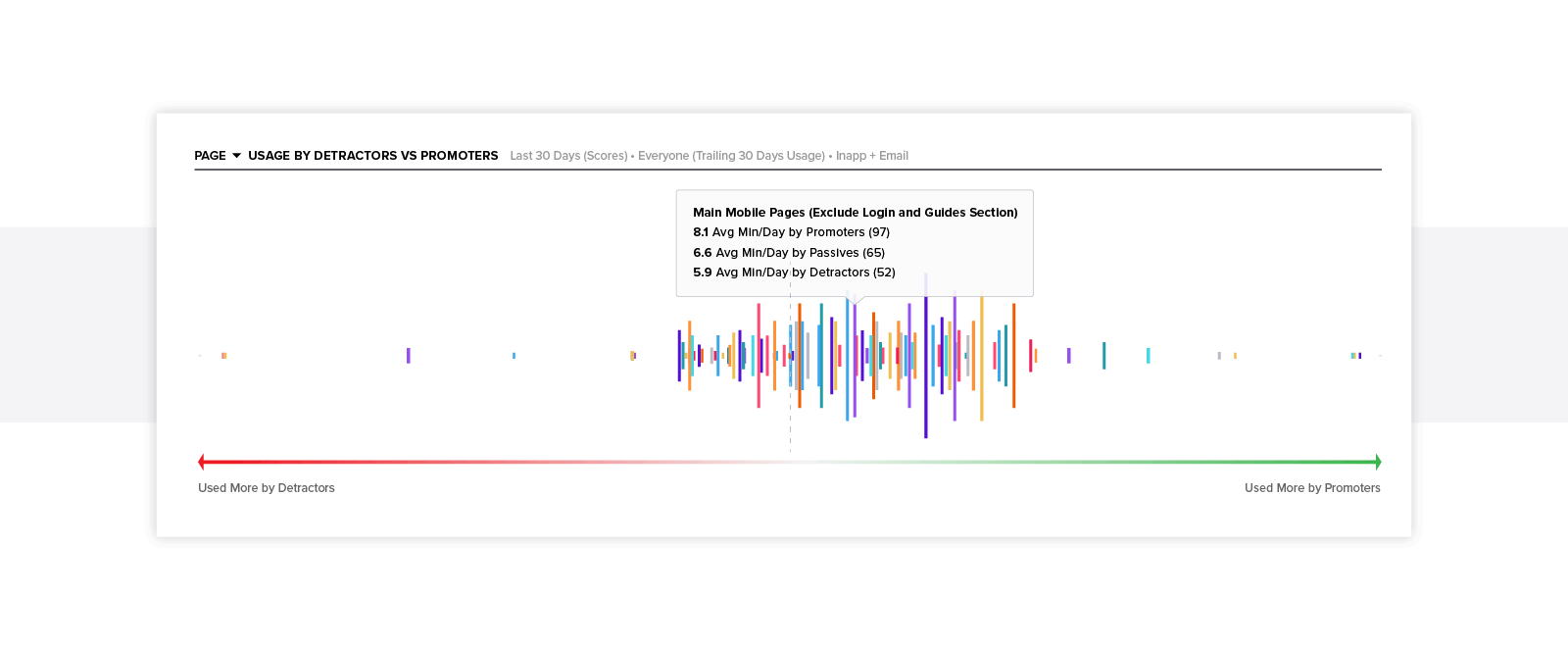
WHY DOES DEVICE USAGE VARY BY ACCOUNT OR USER?
Having analytics at the account and visitor levels enables you to understand the root cause underlying the behaviors you’re observing. By looking at the individual actions of your mobile power users vs. your web power users, you can start to identify patterns that indicate which customers are more likely to embrace or ignore certain experiences.

Evaluate whether device usage varies by:
- User role or persona
- User department
- Account industry
- Use case
- Account health
By identifying which users are more likely to adopt mobile vs. web, you can ensure you’re making product decisions that optimize for the right personas and meet user expectations. These analyses can also illuminate potential ways you could encourage cross-device behaviors that align to value.
What does multi-screen product usage mean for my business?
While having a holistic view of your multi-screen product usage is the first step in optimizing the journey, you must be able to contextualize this usage in the business outcomes that result. As digital products become even more prolific, the product is often the primary vehicle for how a customer interacts with your business. As such, product usage can be a good proxy for customer health. Knowing how product usage correlates to actual business outcomes, like retention or up-sell/cross-sell opportunity, will help ensure your product strategies produce the ROI you anticipate.
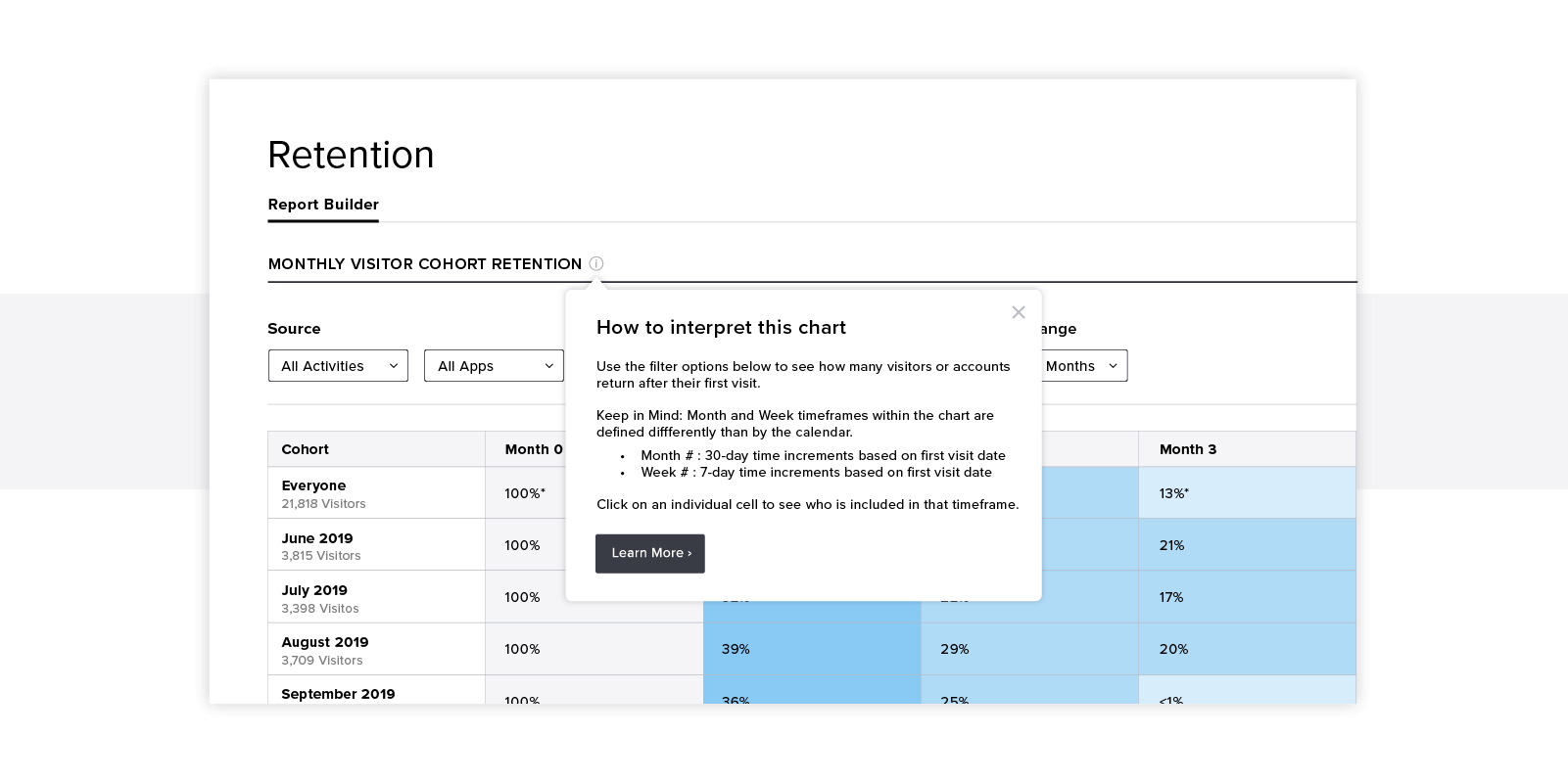
Cohort retention analysis enables you to understand how retention for web-only or mobile-only users varies from retention of multi-screen users. In addition, you can create different segments of users to determine what usage thresholds result in higher retention rates. User segmentation also allows you to see how user satisfaction ratings, customer health score, or annual revenue may vary by product usage (or mobile app version).
This type of insight not only provides important indications of where you can continue to improve the customer experience, but also enables your customer success teams to take a proactive approach to anticipating and preventing churn. In understanding usage patterns that are more likely to produce negative outcomes, customer success managers can monitor at-risk customers and reach out to provide additional support.
Product usage patterns can also help identify high potential targets for expansion opportunities. You can observe the usage of your most profitable customers and find users or accounts who mimic their needs and behaviors. By capturing how similar accounts achieved value through this additional functionality, your revenue teams can have a more focused view on accounts who may be more likely to convert.
How can I shape product usage and the related customer outcomes?
With a more robust understanding of multi-screen user behavior and the outcomes these behaviors generate, you may uncover aspects of the user journey that cause friction or don’t produce the results you anticipate. But these insights can’t produce value unless you’re able to take action on them.
In general, there are three actions you can take in areas where your product experience is failing:
- Make updates to the product
- Eliminate the features or elements that are causing confusion
- Release in-app messages or guides to help with education and unblocking
Each option has its time and place. Each also has cost and benefit, in terms of technical overhead, time to deploy, short- and long-term impact and durability, collateral impact on other parts of the user journey, and ability to confidently control and test in an experimental capacity before committing to a solution. Here are some circumstances to consider when deciding which action to take:
MAKE UPDATES TO THE PRODUCT
Often, this option will have the biggest impact on long-term usability. While this may normally be the best permanent solution, it almost always also requires the most time, people, and expense to get right (and doesn’t prevent some users from having a subpar experience in the interim, or even after-the-fact).
Reserve this option for the highest priority opportunities that will produce the biggest ROI for user outcomes, and leverage in-app guides as a temporary fix while you’re implementing and testing the changes.
ELIMINATE THE FEATURES OR ELEMENTS THAT ARE CAUSING CONFUSION
One of the biggest benefits of product analytics is easily revealing features that rarely or
never get used. Use in-app walkthroughs to test whether these features are suffering from an education issue and, if that doesn’t solve the usage challenge, consider whether these features should be sunset or immediately retired. By eliminating products that aren’t producing real business benefit, your team can gain time to work on higher value projects.
RELEASE IN-APP MESSAGES OR GUIDES TO HELP WITH EDUCATION AND UNBLOCKING
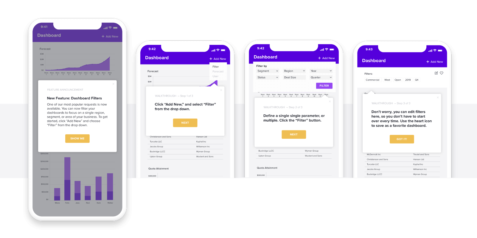
In-app guides and messages are often the best first course of action, as they don’t require help from engineering and can validate whether there’s a larger product challenge that warrants involving technical resources. There are four primary types of in-app guides you could deploy:
Walkthroughs: Walkthroughs, or multi-step in-app messages, are designed to walk users through a complete workflow. Walkthroughs can be triggered by user behavior and can be targeted to particular user segments, accounts, or individual visitors. While helpful to relay more complicated information or multi-step processes, walkthroughs can quickly become overwhelming for users if they are used too generously. Be sure to measure completion and drop-off rates to identify if the walkthrough is too long or if any steps are too complicated.
Tooltips: Tooltips are in-app messages that typically appear when users navigate to a specific area or perform a certain action in the product. The most common type of tooltips are “hovers,” which are messages that appear when the user moves their cursor over a navigation menu, interactive element, or pre-determined “hotspot.” Tooltips should primarily be used to provide supplemental explanations for features that would otherwise clutter the UI if permanently displayed.
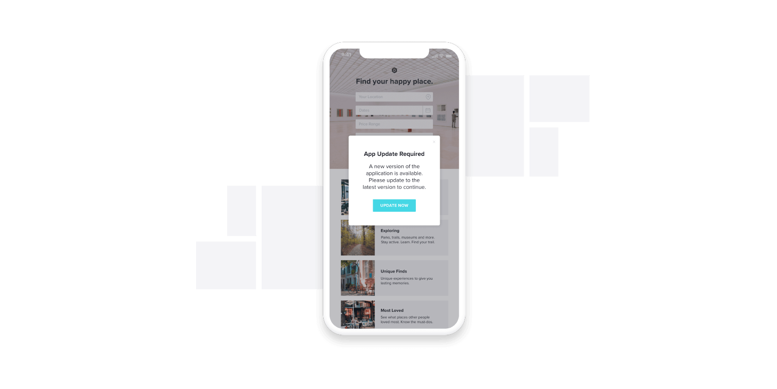
Lightbox: Diese Art der In-App-Nachricht wird auch als „Pop-up“ oder „Modal“ bezeichnet, wobei oft der Rest der Seite abgedunkelt wird, um den Inhalt der Box hervorzuheben. Einige Lightboxes hindern den Nutzer sogar daran, mit dem Rest der Seite zu interagieren, bis die Nachricht verworfen wurde. Da Lightboxes aufdringlich wirken können, eignet sich dieses Format am besten für wichtige Nutzerbenachrichtigungen, die eine Bestätigung erfordern.
In order to determine which type of guide to use, you should consider the purpose or function of the guide you’re building. Common functions include:
New user or new feature onboarding: Compared to outbound email or information warehoused on a blog or in a knowledge base, using in-app messaging to deliver onboarding while the user is active in the product can increase resonance. Customize the onboarding based on user data (role, account, sentiment) to ensure you’re guiding users to the tasks and features most valuable to them.
Tutorial: Once you’ve identified areas in your product that cause confusion, you can use in-app guidance to proactively help users troubleshoot. Linking to help articles and providing step-by- step guidance can help show users the most efficient path to complete certain tasks.
Announcement: Certain time-sensitive scenarios may make in-app messaging a better communication vehicle than e-mail. Letting customers know about planned maintenance or a planned outage in-app can help preempt an influx of support calls and tickets.
For mobile products, you may also want to encourage users to upgrade their version of the application while they’re using the app. For web-only users, announcements can be an easy way to recommend downloading the mobile app exactly where and when it’s top-of-mind and relevant to the journey.
Delight or Promotion: Use in-app promotions to reward your promoters or convert your detractors. These promotions can be an easy way to create moments of delight, increase user satisfaction, and turn your power users into advocates. For example, you could provide an incentive targeted at your promoters to provide a review for your product on public forums, increasing your ability to get positive reviews that bolster your competitive edge.
These behavior-aware messages can also help acknowledge progress or respond to external events like a user’s birthday or newsworthy events about the company or product. Delight messages can take the form of progress trackers, usage streaks, or gamification.
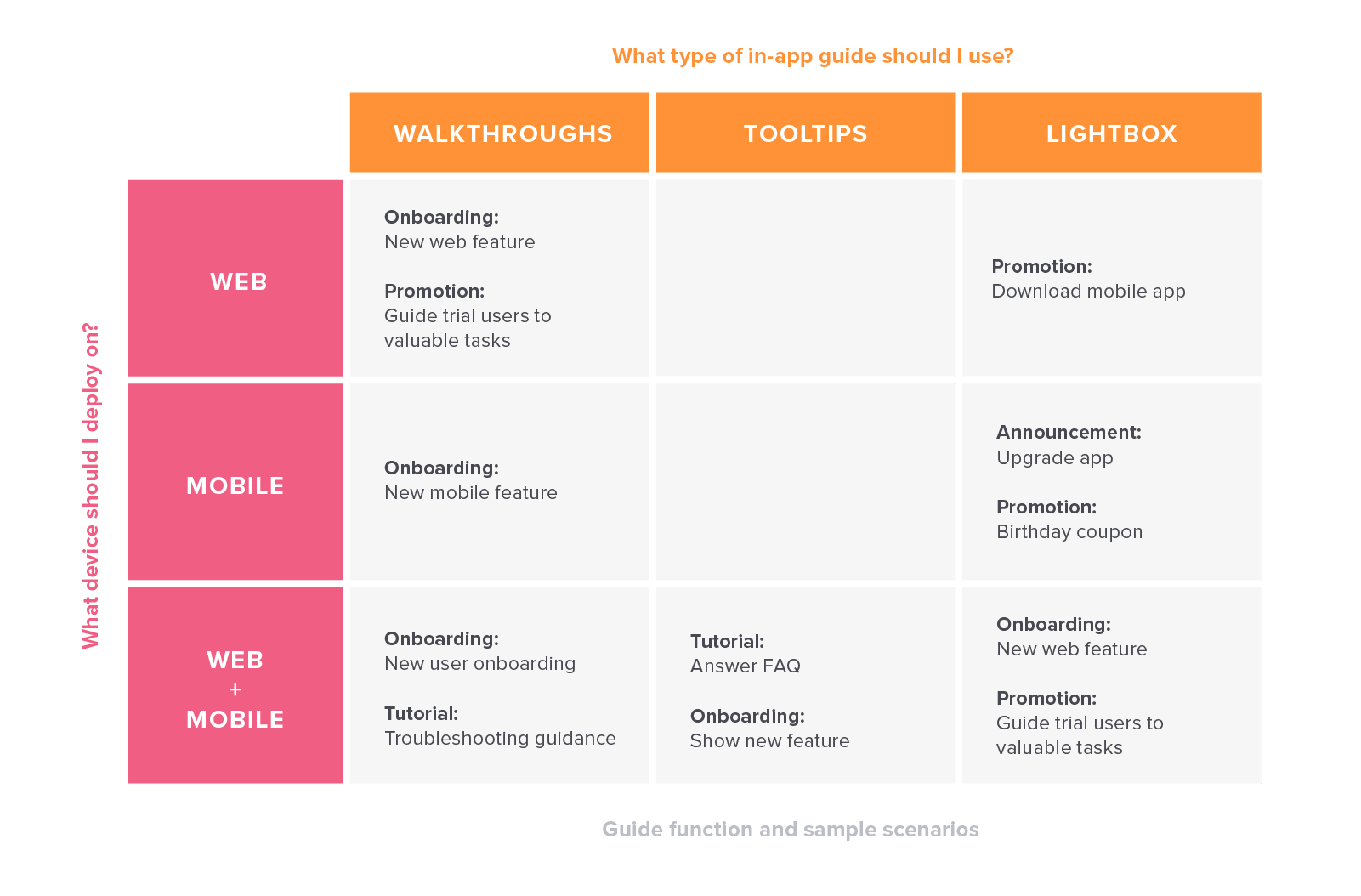
Deciding which type of guide to deploy and which device to deploy it in should be based on the function of the guide. Here is an example matrix of when and where you might consider using different guide types:
IN-APP GUIDES IN ACTION
A suite of web and mobile apps developed by Iowa-based Cartegraph empowers cities, parks, and government agencies — their leaders and field workers — to manage infrastructure projects, track assets, and report back on progress. Cartegraph’s mobile app is meant to make it easier for field crews to manage their work.
By tracking feature usage, the Cartegraph product team learns where to deliver in-app messages to drive behaviors in the app
that lead crews to complete the work in the field more effectively and efficiently. In the six months after launching guides in the mobile app, Cartegraph saw a 62% increase in mobile adoption. Read more about Cartegraph’s story here.
What does usage mean for my multi-screen product strategy?
As the expectations and competition for digital products continue to rise, the pace of innovation is increasingly important. Customers expect a great product experience and will find a replacement for products that don’t quickly provide value. Product usage analytics and in-app guidance can enhance your ability to innovate faster and build a more profitable multi-screen strategy.
In thinking about optimizing your multi-screen customer journey and releasing more streamlined, user friendly mobile apps, you should establish an internal process for innovation. One example framework that leverages both usage analytics and in-app guidance could look like this:
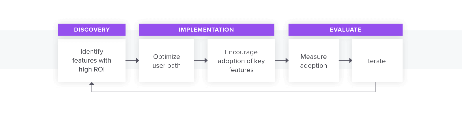
In the discovery phase of the process, you should be relying on product analytics to not only identify which features are used most often in your web and mobile products, but also to understand which features produce the best customer outcomes. Once you’ve identified these “high ROI” features, you can evaluate the paths and funnels around these features to look for opportunities to streamline the users’ ability to take advantage of these features in web and mobile. Also be aware of the features that seem to have low ROI – these could be worth evaluating for retirement to help reduce distraction from the higher ROI elements.
Once you feel confident that these are the features you should focus on and have more informed hypotheses about UX preferences, you can then enter the implementation phase and make these updates to the product. Once these changes have been implemented, you can use in-app guidance to encourage even better adoption of these features.
In the evaluation phase of the innovation process, use analytics to monitor behavior and assess user sentiment. From there, you should continue to iterate until you feel satisfied with user adoption and can move on to building the next set of features in your roadmap.
Getting these immediate feedback loops through usage insights will unlock your ability to innovate faster, build more user friendly mobile apps and products, and produce better business outcomes.
Thriving in the multi-screen era with Pendo for Mobile
With Pendo for Mobile, you can create a connected digital experience across your mobile and web product portfolio. Analyze how your users interact with your solution in all settings, and understand how users move across platforms. Harness insights throughout the product journey and tailor in-app guidance based on the user’s device.
Pendo has been helpful in every stage of the customer journey for our mobile application from onboarding to engagement and retention. We’ve used Pendo for guiding our customers in our app, for reducing customer complaints and queries, for engaging customers, and collecting feedback. This has helped us to significantly reduce the time spend on customer communications, platform development, etc. and to increase customer engagement and satisfaction.
–Anupam Jayadeep, Product Owner, LuLu Exchange
Pendo for Mobile will empower you to optimize your multi-screen journey by:
- Tracking user behavior across platforms. Collect and analyze product data in both web and mobile environments to achieve a more complete understanding of how users interact with your solution. Leverage these insights to know how multi-screen usage impacts your most important KPIs.
- Enabling faster innovation and iteration. Identify methods that resonate in a mobile setting, adjust strategy, and employ mobile application data for faster product innovation.
- Engaging and retaining mobile users. Maintain your product level of excellence in mobile applications and guide users toward the most valuable product experience, regardless of platform. Deliver segmented guidance based on user actions to deliver the right message at the right time.