 Pendo has always had the broad vision to be an entire platform for product analytics and engagement. But as we realized that vision, we started to outgrow our original main navigation architecture. Redesigning such a key component of a product is a massive undertaking, so we wanted to share a bit of insight into how we used Pendo to gather insights and manage expectations. Also, how we met our key goals of designing navigation that is scalable and sustainable for the future of Pendo, and which allows our customers to better focus on their data and the task at hand.
Scalable & Sustainable
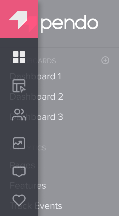
With the release of retention analytics and multiple dashboards last year, Pendo’s navigation became more complex and increasingly hard to scale. At first, we combined trends, paths, and funnels into an expanding menu, and limited users to three dashboards due to a sheer lack of vertical space. Even with these “band-aid” solutions in place, the root problem still remained. We needed a sustainable system capable of growing with Pendo.
In addition to the obvious issue of space on the screen, a less-obvious yet fundamental concern arose around the simplicity of Pendo’s information architecture; all of Pendo was housed in three sections that were not overly effective at simplifying the main navigation. Through a series of iteration and testing both internally and externally with customers, we arrived at a revised architecture. Most notably among the changes, we split up “analytics” into three categories (there are a lot of analytics in Pendo):
- Product (pages, features, and track events)
- People (visitors and accounts)
- Behavior (trends, retention, paths, and funnels.)
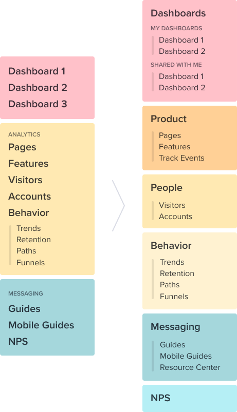
Even though we created a more extensive set of categories, the end result was a simpler “top-level” navigation — six first-tier items as opposed to nine plus. And we now have plenty of room to add in new features at the second tier without overcomplicating the permanent view.
Show Me The Data (not the nav)
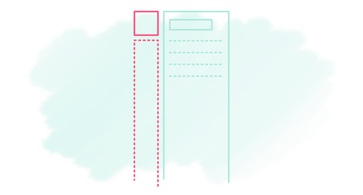
One of Pendo’s core values is “Show Me the Data”, a challenge to our entire company to ensure that every initiative and decision is informed by data. Given the high volume of information in Pendo, be it complex tables or detailed visualizations, screen real estate is at a premium. A main focus throughout the project was reducing both the size and visual noise of Pendo’s navigation, taking our core value literally and showing our customers their data more effectively. The final version is 136 pixels slimmer to be exact, which is enough space to fit an extra table column, or a couple more months of Retention data, for example.
Powering Data-driven Design with Pendo
Pendo played a significant role in all phases of this project. But guides were particularly helpful for delivering prototypes for customer feedback. In nearly 50 customers providing feedback and driving refinements across three rounds of iteration. Customers appreciated the opportunity to weigh in easily and without disrupting their schedules, though plenty were also happy to follow up with more in-depth calls with our team. (Thanks everyone!)
Powering Data-driven Design with Pendo(zers)
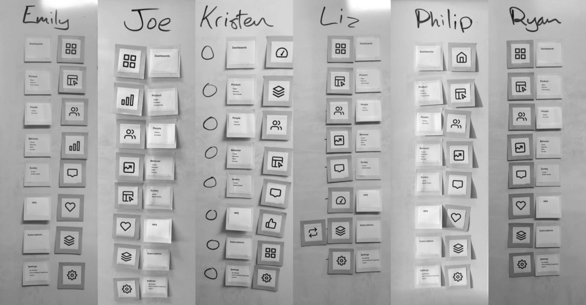
Along with plenty of customer research, we also borrowed our very own coworkers to inform design decisions. In addition to having them perform general usability testing, we created a game called “Pin the Name On the Icon” (not really), in which Pendozers across sales, customer success, and other departments each selected icons from a pool and matched them to categories in the navigation, helping us gather data on the most intuitive imagery. Lastly, we released the new navigation internally three weeks before launch, allowing Pendo employees to familiarize themselves. This also gave us time to make final improvements before releasing it to all customers.
Managing the Release
Nothing disrupts your workflow like opening up your favorite app and realizing something has changed, so we took measures to ensure a smooth transition. We used a guide to communicate the release a week before launch, gave customers access to the latest prototype, and a direct line to our product team for questions or feedback.
While publishing a guide to preview the coming navigation release certainly helped, it was of course still necessary to launch guides announcing its arrival, noting major changes and instructing users on how to provide feedback using the new version. In addition, we also linked to this article allowing our users to learn more about the project (meta, right?).
Now that the initial vision of our redesigned navigation is in the wild, we are excited about more improvements to come. Stay tuned!